Pages

Sunday, July 24, 2022

Millions of Cats: Monochromatic Illustrations into the 21st Century

Millions of Cats

Monochromatic Illustrations into the 21st Century

Article 13

by Lyn Lacy                                                8000 wds


        Children in America have not always had colorful pictures in their books. Nineteenth-century illustrated books most often had black and white woodcuts, because simple relief carvings could be printed alongside texts. One noteworthy illustrator in the 1840s was Felix Octavius Carr Darley (1822-1888), popular for his black and white drawings in Harper’s Weekly, lithographs in books by Washington Irving (1783-1859), Nathaniel Hawthorne (1804-1864), Charles Dickens (1812-1870) and over 350 drawings for James Fenimore Cooper (1789-1851). 

        A self-educated artist beyond compare was William Wallace Denslow (1856-1915) who illustrated L. Frank Baum’s bestselling children’s book of 1899, Father Goose: His Book, with high-quality monochromatic pictures that were considered better than any others done at that time, rivaled only by his black and white illustrations the next year for The Wonderful Wizard of Oz (1900). Denslow’s later work in color was typified by bold, dark borders outlining figures filled in with flat colors, in a style called “poster art.” This was similar to the black-inked wood-block illustrations of colorful animals by Charles Buckles Falls (1874-1960) for The ABC Book (1923). 

        Also notable was Jessie Willcox Smith (1863-1935) who created a series of Mother Goose illustrations for Good Housekeeping which were in black and white until 1914, when they were printed in color for her book, The Jessie Willcox Smith Mother Goose. Smith made illustrations for more than 250 periodicals, 200 magazine covers and 60 books from 1888 to 1932, was one of the highest paid illustrators of her time and became known as one of the greatest female illustrators.  

        When color became easier and cheaper in the picture book industry, illustrators and children alike welcomed its arrival. An outpouring of extraordinary talent in the 1930s resulted in every major publishing house in America releasing at least one picture book in color that is considered today to be a classic in children’s literature (see Article 12). That is not to say, however, that the magic and allure of black and white ever left. Notable for this discussion is that, compared to those numerous classic titles that began 1930, only one from two years before has remained continuously in print, and its illustrations were done in black and white. 

        That book has been called America’s first picture book.

Millions of Cats.

        Wanda Gág (1893–1946) wrote and illustrated Millions of Cats (1928) in the fairy tale tradition of her German-Bohemian heritage, and her black and white drawings were reminiscent of 19th century Eastern Europe. She was born in New Ulm, Minnesota, the oldest of seven children of a painter and church decorator Anton and his free-spirit, creative wife Lissi, both of whom died when Wanda was a young woman. She took on the raising of her siblings, with help from “the Grandma Folks” and sporadic interference by social services in the little town. All of the children finished high school, and Wanda moved them to Minneapolis while she attended art schools in the Twin Cities 1913-1917, then won a scholarship to the Art Students League of New York. 

        All but one of her siblings followed her to New York, where she earned a living as a commercial illustrator until she was acclaimed "one of America’s most promising young graphic artists” in 1926 after a one-woman-show in the Weyhe Gallery. This acclaim led to an editor’s taking an interest in her, asking Gág to illustrate a children’s book, which was Millions of Cats. To escape distractions in the City, she rented a farm in New Jersey, Tumble Timbers (1925-1930), then purchased All Creation, where her brother and youngest sister came to live and work for her. Flavia Gág went on to author and illustrate children’s books as well (Lacy, "Wanda Gág: A Minnesota Childhood," 2019, youtube).

        Gág received a 1929 Newbery Honor Book award for Millions of Cats, noted for her “original creative work in the field of books for children.” She also wrote and illustrated The Funny Thing (1929), Snippy and Snappy (1931), The ABC Bunny (1933), Gone is Gone (1935) and Nothing At All (1941), as well as translating and illustrating four books of Grimm’s fairy tales. She was awarded her second Newbery Honor Book for ABC Bunny, and the first edition stated that the illustrations were “printed in lithography on paper made especially for this edition.”

        A decade after publication of Millions of Cats, the Caldecott Medal was established for the “most distinguished American Picture Book of the preceding year,” and other books considered distinguished were designated as Honor Books. Gág received two Caldecott Honor Book awards, one for her illustrated translation of Snow White and the Seven Dwarfs (1938) and a second three years later for her last picture book, Nothing At All (1941), the only book she did in color. She was forced to accomplish her red and green illustrations in a laborious process to cut costs during wartime, and she complained about having to use lead pencils on glass under fluorescent lighting.  

        With Millions of Cats, Gág may be given credit for an increased interest in picture book creation in America by publishers, artists and the public, as witnessed by the outpouring of classics in the years following her first book. Gág’s ten illustrated titles over twenty years established a high standard in America for the integration of art and text in children’s literature. She had pioneered a new format in which scenes were composed across double spreads, and the artwork and text were uniquely intertwined. She mixed up the order of pictures and text and stretched pictures onto more than one page. Virginia Lee Burton (1909-1968) was one to notably use this same approach for composition in her 1943 Caldecott Award winner, The Little House. 

        Most of Millions of Cats black and white illustrations were confined beneath an arch of clouds in the sky, a canopy of treetops or even a curved ceiling of the cozy little home of the very old man and woman in the story. She favored such arched compositions in subsequent picture books, except for ABC Bunny (1933) in which black and white illustrations were squared off, one to a page, each framed by an identical white margin. 

        Gág is widely considered a crucial figure in the development of the picture book form, and for fifty decades her ideas paved the way for modern illustrators. Those who have chosen storytelling in black and white often cite her as their inspiration.

        In the first half of the 20th century, publishers continued to insist that first time illustrators continue creating in black and white rather than color, usually because they were unknown as money makers and the four-color process was complicated and more expensive. Just a bit of color began showing up in monochromatic picture books as early as the 1930s, when illustrators were first allowed by publishers to incorporate color as accents for certain elements within black and white pictures. Into the 1940s and 1950s, black line drawings began to be imposed over splashes of color or entire backgrounds composed of color. Such books might be called “crossovers,” in that their illustrations are part color and part black and white. As technologies for color reproduction improve, illustrations with various mixes of monochromatic and color continue to this day.  

        A dilemma was raised for this author of Children’s Classics Revisited about how to proceed with reviews about black and white illustrations when such bits or splashes of color were involved. The quandary was solved when one stops to consider whether the intent of the illustrator appears to be the creation of characters and settings primarily through the black and white drawings. If so, the addition of color very likely has less to do with actual storytelling than it does with aesthetics.

        In addition, historical precedent was set for legitimate consideration of such titles today when books from the 20th century were called black and white picture books even when they had bits of color. An example is Mitten (1936) by Clare Turlay Newberry (1903-1970) which has red accents. By the 1960s, even more dramatic examples came from two Caldecott Medalists. First was Always Room for One More (1965) illustrated by Nonny Hogrogian (1932-), with text by Sorche Nic Leodhas, which had background splashes of soft purple—the color of heather, the Scottish national emblem—which were nothing more than aesthetic. The next year was Sam, Bangs and Moonshine (1966) by Evaline Ness (1911-1986), with images colored in by splashes of reddish brown and olive green. The illustrators’ dependence on the drawn line is evident in both books, however, and the settings and characters would easily stand alone if no colors were involved.


        Other 20th century titles might be considered  “crossovers” combining bold line drawings with heavy use of accent colors (see Appendix A). Chronological lists of both Caldecott Medal and Honor Book recipients may also be instructive to gauge continued popularity of monochromatic illustrations in the 20th century (see Appendix B). When a book is not purely in black and white, a note is made after the entry. Year of publication—rather than year of receiving an award—is cited to facilitate bibliographic searches.

        In addition to Wanda Gág and other legendary names in children’s literature in the 20th century, eight warrant attention here because of their significant contributions with black and white illustration throughout long careers —Dorothy Lathrop (1891-1980), Robert Lawson (1892-1957), Clare Turlay Newberry (1903-1970), Lynd Ward (1905-1985), Robert McCloskey (1914-2003), Maurice Sendak (1928-2012), David Macaulay (1946-) and Chris Van Allsburg (1949-). Many picture books by these and others that have black and white illustrations were reissued in later years with colorful covers.

        Lathrop illustrated Animals from the Bible (1937), text by Helen Dean Fish, for which Lathrop received the inaugural 1938 Caldecott Medal for her black and white illustrations (cover in color added later). She started illustrating books in 1918, and the first picture book she wrote as well as illustrated was The Fairy Circus (1931), a Newbery Honor Book, with black and white drawings alternating with color illustrations across double page spreads. She returned to all black and white in Who Goes There? (1935), her first book with drawings in lithographic pencil on illustration board. Anne Roberts, in her essay "Dorothy Lathrop's World", discussed the artist’s forty-five-year career: “It's as if she would pick up a pen and become a different artist entirely. Her output was prodigious, even staggering. What makes this all the more impressive is the variety of media in which she worked: pen and ink, oil, watercolor, gouache, colored pencil, graphite, woodcut, wood engraving, lithographic pencil and lithographic crayon. Each medium has its own exacting demand, and she mastered them all” (“Flora, Fauna & Fantasy: The Art of Dorothy Lathrop,” Brandywine River Museum, 2006).

        Lawson illustrated almost seventy picture books and novels in black and white during his 35-year career. Before the Caldecott Award was established, he had illustrated in black and white The Story of Ferdinand (1936) by Munro Leaf. He and Boris Artzybasheff (1899-1965) received the first Caldecott Honor Book awards in 1938 for black and white illustrations in Four and Twenty Blackbirds: A Collection of Old Nursery Rhymes (1937), with text by Helen Dean Fish, and for Seven Simeons: a Russian Tale (1937). When Lawson was awarded the Caldecott Medal for They Were Strong and Good (1939), he wryly remarked that perhaps some year no such award should be given, hinting that the 1940 Caldecott Medal Selection Committee might actually be rewarding him for The Story of Ferdinand.


        Newberry was author and illustrator of seventeen monochromatic picture books (many of them with splashes of color), all but three of them featuring “the very best cat pictures that have ever been made” (New York Times, 1936). She received Caldecott Honor Book awards for four of her masterful “cat books”—Barkis (1938) was the first—and explained her pen and ink sketches and pastel drawings in Drawing a Cat (1940). 

        McCloskey was awarded the Caldecott Medal for sepia illustrations in Make Way for Ducklings (1941) and Caldecott Honor Books for blue and white illustrations in Blueberries for Sal (1948) and One Morning in Maine (1952) in black and white. For his third Caldecott Honor Book, Journey Cake, Ho! (1953), with text by Ruth Sawyer, “he created illustrations in several colors for the first time. It was, consequently, his first experience in making the color separations required for the printing process…In Time of Wonder (1957), for which he was awarded his second Caldecott Medal, he was encouraged to illustrate in full color. Though he had wanted to use color earlier, editor May Massee had resisted his suggestions, citing the enormous expense of producing such a book, as well as McCloskey’s inexperience.” (Gary D. Schmidt, Robert McCloskey, 1990). Make Way for Ducklings compared nicely to another monochromatic Caldecott Medal winner that should not be ignored, Mei Li (1938), by Thomas Handforth. Both illustrators were masters at creating textures and contours in black and white.

        Ward was not only awarded the Caldecott Medal for his black and white picture book, The Biggest Bear (1952), but he had similarly illustrated The Little Red Lighthouse and the Great Gray Bridge (1942, red accents) written by Hildegarde H. Swift. He created a remarkable 175-page black and white wordless book with seven chapters, The Silver Pony (1973).


        Sendak was known for his masterful black and white style in the tradition of mid-19th-century English and German illustrators. Of his seven Caldecott Honor Book awards, four were illustrated in black and white. A Hole is to Dig: A First Book of First Definitions (1952) by Ruth Krauss was “printed on brown-tinted paper and, to enhance its old-fashioned look, Sendak deliberately incorporated a good deal of ink crosshatching into his pen and ink drawings.” For What Can You Do with a Shoe? (1955) by Beatrice Schenk de Regniers, he made highly effective use of a crisp black line, giving an edge to otherwise soft red-and-gray-wash illustrations…The color in his early books had been achieved by the use of separate overlays done on acetate, with the colors selected from available printer’s inks and applied at press time. But for his first book in full color, Charlotte and the White Horse (1955) by Ruth Krauss, he simply painted using whatever colors he chose, and the artwork was reproduced by a sophisticated process which separated the various colors for printing” (Selma G. Lane, The Art of Maurice Sendak, pp. 43, 45, 53). For illustrations in Higglety Pigglety Pop! or There Must Be More to Life (1967), Sendak returned to black and white. 

        Macaulay spent over twenty years creating black and white picture books that explained architecture, design and engineering in his signature way. The hilarious Motel of The Mysteries (1979) and the beautiful Rome Antics (1997) stand as “stories about architecture” that bracket his career as a black and white artist. Many of his famous titles, such as The Way Things Work series starting in 1988 and Caldecott Honor Books, Cathedral (1973) and Castle (1977), have been colorized in the past ten years. Known for his sense of humor, the illustrator named his Caldecott Medal winner Black and White (1990), even though the picture book has only one double spread that is monochromatic. In Rome Antics, a thin red line swoops in, out and around buildings, indicating the flight path of a bird that guides the tour of a beautiful city the illustrator knows and loves so well.

        Van Allsburg started a serious contemporary American revival of black and white storytelling with The Garden of Abdul Gasazi (1979), a Caldecott Honor Book, followed by his Caldecott Medalist Jumanji (1981). Van Allsburg is a consummate draftsman whose extraordinary multiplicity of gray tones conveys ominous moods and eerie subtleties. No discussion of black and white illustration is complete without highlighting his complex plots as well as the sculpted figures in his illustrations. As a matter of fact, he is a sculptor, which was evident to a child who said his pictures looked like “photographs of clay people.” Of the illustrator’s seventeen picture books, eight more were in black and white, such as Ben’s Dream (1982). Of his seven picture books with color illustrations, Polar Express (1985) also received the Caldecott Medal. 

        Into the 21st century many award-winning picture book illustrators continue to entice youngsters with the subtlety and grace of monochromatic illustrations, even when children are bombarded in their daily lives with resplendent color in print, electronic and digital media. When the illustrators have been asked why they chose black and white to tell stories, they have talked about the boldness, crispness, clarity and simplicity of black on white paper and the effect of chiaroscuro achieved with light and shadow. 

        Others replied they wanted to reflect a bygone, black and white era. They admired the British and German engravings, woodcuts and lithography of the 18th and 19th centuries. They paid homage to early 20th century American picture books, newspaper cartoons, pulp magazines and comic strips. They liked film noir from the 1930s and 1940s and picture books, they said, are like little movies. They remembered their own black and white TVs at home when they were kids. Some said they grew up drawing with a #2 Ticonderoga, and wielding a pencil was what they know best.

        A woodworking friend told of his experience: “Black and white illustrations remind me of the earliest days of my career. I was completely averse to adding any color to the wood I was working with. I just thought that the wood itself and its grain were so beautiful that there was no reason to alter it. As with the grain in wood, a black and white picture is kind of a natural thing that can be subtle, bold, light or dark. Black and white pictures convey much stronger images than ones in color. You have to face these images and starker contrasts in a different way, and a whole different set of emotional responses can be the result. Such an expanded way  of thinking and feeling is even greater with children.”

        For the very reason the woodworker mentions, the stronger images of black and white silhouettes are recommended in board books for babies and toddlers. Research has shown that babies first see white, black and shades of grey (one of the first colors they see is red). Tana Hoban (1917-2006) created high-contrast silhouettes in concept books, starting with Black on White (1993), as well as two dozen picture books with color photographs. 

        The artistic medium of still photography, like woodworking, can also excel when it is devoid of color. Architecture, sculpture and movies are other such endeavors that must not rely on color. A potter who fires her pieces in an electric kiln that relies on oxidation (which keeps them colorless) explained, “I loved the way that not using color brought out the lights and shadows and lines.” Some illustrators involve themselves in other artistic pursuits such as these, which certainly adds to an understanding of their preferences for black and white illustration.

        Continuing into the 21th century with a list of Caldecott recipients may indicate a strong interest in black and white illustrations (see Appendix B). Highlighted below are two dozen picture books—some Award-winners and other titles equally as distinguished—that have shown remarkable innovation in the use of black and white to tell stories, sometimes with bits and splashes of color.  


2000 Ian Falconer (American, 1959-), Author and Illustrator. Olivia, board book, Atheneum, 6.2” x 8.2”, 34 pp

        Olivia the little pig is a joy, and she’s also good at lots of things, red in particular—red bits, that is, such as her red dress and radio. However, Falconer has been called a minimalist in his 2001 Caldecott Honor Book, because Olivia is drawn alone in black on white. Reproductions of art by famous painters plus new colors are introduced in each of the seven Olivia books that follow. Olivia by now has a dozen books and spinoffs, and only the first couple were monochromatic or with bits of her favorite color, red, as in the second, Olivia Counts (2002).

2000 Christopher Bing (American, n.d.), Illustrator. Casey at the Bat: A Ballad of the Republic Sung in the Year 1888, written by Ernest Thayer, Chronicle, 32 pp, 9.2”x12.2”

        The immortal ballad of the 19th-century baseball star is illustrated to look just like an old scrapbook, with ephemera such as newspaper clippings, photos, baseball cards, tickets and ads, sometimes with bits of color. The illustrator of this 2001 Caldecott Honor Book explained in his artist’s notes: “The black and white illustrations were drawn using pen, ink, and brush on white (uninked) scratch board…The final images were prepared entirely digitally—the illustrations were scanned and then merged with the ancillary images which had been manipulated or even created digitally using Illustrator, QuarleXPress and Photoshop.” Bing also illustrated The Midnight Ride of Paul Revere (2001) by Longfellow and Lincoln Shot: A President’s Life Remembered (2008).

2002  Tony DiTerlizzi (American, 1969-), Illustrator. The Spider and the Fly, written by Mary Howitt, 40 pp, 11”x 10”

        DiTerlizzi’s illustrations are gothic, sinister and creepy for Howitt’s Victorian-era poem about the suave spider who entices the poor little fly into his home, even while hovering ghosts of past bug victims try to warn her of impending doom. The black, white and silver illustrations in this 2003 Honor Book have the classy creepiness of film noir, and the humor, whimsy and detail bring to life the slimy, slick spider and the foolish, vain fly as she naively meets her fate. A 10th anniversary edition was released in 2012.


2002 Peter McCarty (American, n.d.), Author and Illustrator. Hondo and Fabian, Henry Holt, 40 pp, 8.5” x 9.3”

        In McCarty’s 2003 Caldecott Honor Book, the family dog, Hondo, goes in the car to play on the beach while the cat, Fabian, stays home with the baby and amuses himself unrolling the toilet paper. The warm sepia with gentle touches of soft dark red and blue are captivating, lending to the nostalgic atmosphere. The luminous glow of McCarty’s signature style of drawing with pencil on watercolor paper has been compared to the look of pictures viewed through a scrim, the cloth put over lamps to diffuse light in film and television. McCarty’s sequel, Fabian Escapes, was published in 2007.


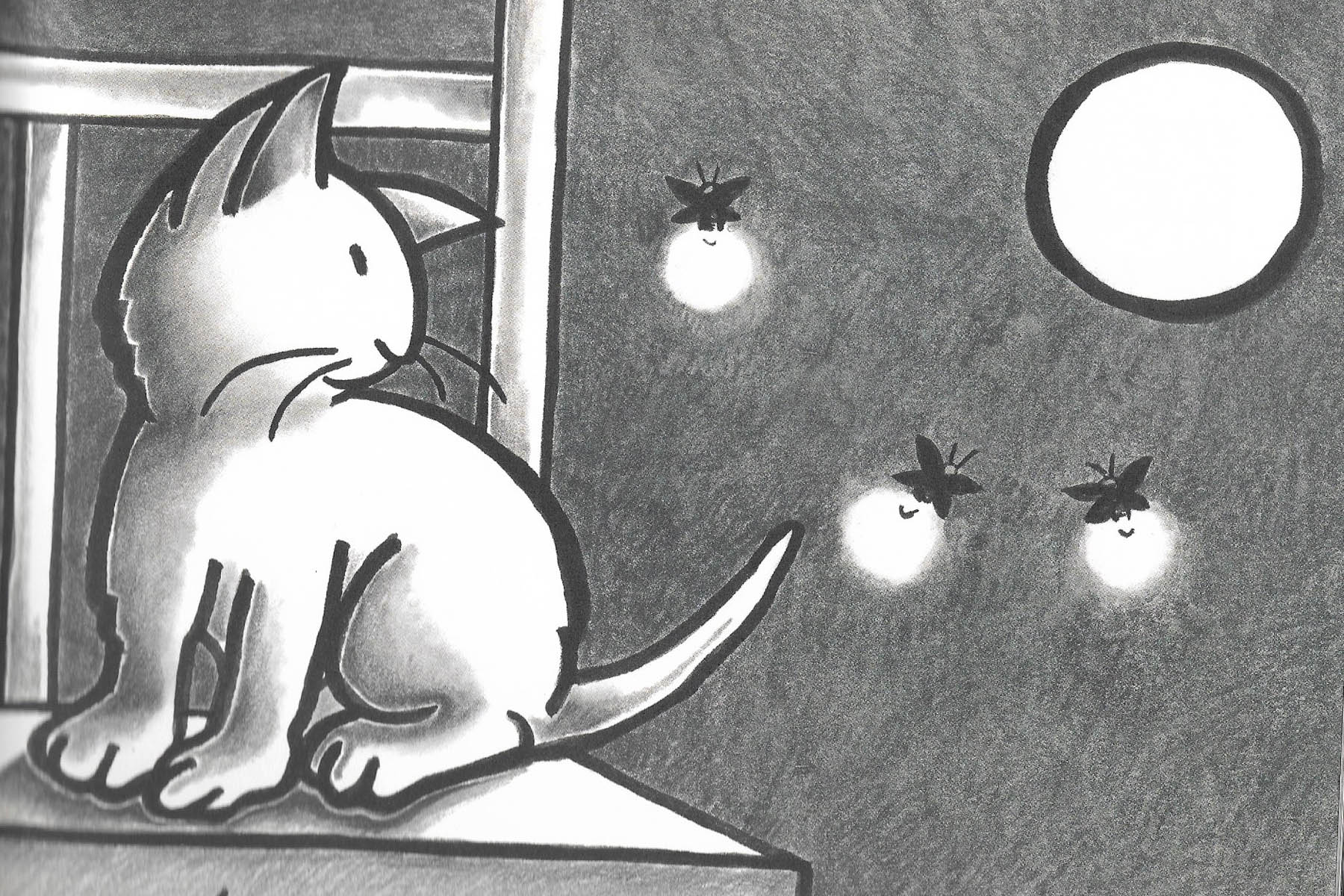
2004 Kevin Henkes (American, 1960-), Author and Illustrator. Kitten’s First Full Moon, Greenwillow Books, 40 pp, 10” x 10”

        Henkes’ 2005 Caldecott Medal acceptance speech at the ALA Annual Conference (Chicago, June 26, 2005) explains the creation of his Award winner, Kitten’s First Full Moon: “From the start I pictured this book with black and white illustrations, bold sans serif type, a square trim size, and soft, creamy paper. I love to use color—even bright color—in most of my picture books, but for this book color seemed unnecessary. I thought that by keeping everything as simple and spare as possible, a better, tighter, more complete book would result. I liked the idea of having a white moon, a white cat, and a white bowl of milk surrounded by the black night. 

        “When I draw, I usually use a crow-quill pen, which makes a rather thin line. This time I wanted a much thicker line, and I wanted the line to vary in thickness, so I drew with a brush—a technique I’d never used in any of my other books. This allowed me a freedom I’d not previously experienced while doing finished art. I’d been used to scratching away for hours making small marks. With a brush I could make broad strokes and long continuous lines. I could define shapes with a single motion. (Henkes uses the same broad, continuous outlines—this time to define pastel-colored figures—in his 2018 picture book, A Parade of Elephants.)

        “The art was prepared using black gouache for the line and black and gray colored pencils. But the book was printed in four colors on a full-color press. This gave the illustrations a richness and depth they wouldn’t have had if the book had been printed with black ink only. Although the finished art is very dissimilar to hers, I thought of Kitten’s First Full Moon as a sort of tribute to Clare Turlay Newberry…And although she isn’t given a name other than Kitten, I secretly think of my heroine as Clare. I also admire the work of Jean Charlot…And of course, I was thinking of the great Wanda Gág.” (Summer/Fall 2005, Children and Libraries, ALSC)

2005 Matt Tavares (American, 1975-), Author and Illustrator. Mudball, Candlewick, 32 pp. 9.3” x 10.8”

        Of seven baseball books by Tavares, Zachary’s Ball (2000), Oliver’s Game (2004) and Mudball (2005) were illustrated in black and white. Tavares says he illustrated in pencil “partly because that was the medium I felt most comfortable with at the time and partly because monochromatic illustrations felt right…There is that quality and detail you can only get from black and white.” The three uplifting stories—Zachary plays as a Red Sox in the old days at Boston’s Fenway Park, Oliver discovers that Grandpa chose to serve in WWII rather than become a baseball player and Andy hits an impossible home run in 1903—meld perfectly with the atmosphere created by black and white nostalgia. See also Chapter 1 for Tavares’ monochromatic illustrations for The Night Before Christmas, which will be released September 2022 as a new edition.


2006 David McLimans (American, n.d.), Author and Illustrator. Gone Wild: An Endangered Animal Alphabet, Walker, 40 pp, 11.1” x 10”

        Striking silhouettes of endangered animals as letters of the alphabet result in dramatic abstract art in this 2007 Caldecott Honor Book. The black figures on white glossy paper are stunning designs in themselves. Next to each letter, the entire animal is shown in red, and information about habitat is included. The title is also offered as a board book for young children, but the inventiveness of such a stylized approach to a beloved but somewhat timeworn genre is perhaps most appealing to older children and adults interested in art.

2006 Shaun Tan (Australian, n.d.), Author and Illustrator. The Arrival, Cicada (See Chapter 7) 

2007 Brian Selznick (American, 1966-), Author and Illustrator. The Invention of Hugo Cabret (See Chapter 7)

2008 Beth Krommes (American, n.d.), Illustrator. The House in the Night by Susan Marie Swanson, Houghton Mifflin, 40 pp, 7.6” x 10”

        Krommes created black and white scratchboard illustrations with a dramatic touch of yellow watercolor in her 2009 Caldecott Award winner about a little girl’s bedtime rituals. Her website includes a synopsis of her process: “The scratchboard itself is a cardboard or hardwood panel with a thin coating of fine, white clay covered by a layer of India ink…I draw by scratching white lines through the black ink surface. The more one scratches, the brighter a picture becomes.”

        In her Caldecott Medal acceptance speech at the ALA Annual Conference (Chicago, July 12, 2009) , Krommes also explained, “Ann Rider, my longtime editor at Houghton, knew I had always wanted to do a book in black and white and the text was perfect…all about light and dark…It was Ann's idea from the beginning to add the golden highlights. She had admired this effect in a book called Goodnight, Goodnight by Eve Rice, published in 1980.”

        Among Krommes’ favorite picture book illustrations are line drawings by Maurice Sendak for the Little Bear series by Else Holmelund Minarik and Millions of Cats by Wanda Gág. “I have also paid homage to Gág by including her house, Tumble Timbers, within the landscape on the second to last spread (on the bottom right) and to Dr. Seuss's The Cat in the Hat, as we see just a glimpse of Mother's foot coming through the door (on the right in the fifth spread from the end).”


2011 Chris Van Allsburg (American, 1949-), Author and Illustrator. Queen of the Falls, Houghton Mifflin, 40 pp, 8” x 11.5”

        Van Allsburg’s signature monochromatic illustrations tell the 1901 true story of a retired charm school instructor named Annie Edson Taylor, the first to go over Niagara Falls in a wooden barrel. The illustrator who is famous for his fantasies and surreal tales said he wanted to do something that was fantastic but not a fantasy. Because of his background as a sculptor, he also wanted Annie to look like a real person, so he used his daughter’s algebra teacher as a model and researched authentic clothes for her to wear. As is his style, the illustrator framed his unnerving pictures with rigid formality, only occasionally breaking outside the frame, and the result has the look of an old photo album.


2011 Cybèle Young (Canadian, ), Author/Illustrator. Ten Birds, Kids Can Press, 32pp, 9.5”x12”

        Intricate chiaroscuro pen and ink drawings tell the tale of ten birds inventing ways to cross the river. With such names as “Exceptional” and “Brilliant,” each bird uses its own ingenious, outlandish construction until the tenth bird, “Needs Improvement,” shows them the simplest way of all, ending all the silliness and suspense. As background for her detailed drawings, Young uses pale ivory paper in Ten Birds and pale green paper in Ten Birds Meet a Monster (see Article 15). Young received the Canadian 2011 Governor General’s Award for illustration of Ten Birds.  


2011 Lane Smith (American, 1959-), Author and Illustrator. Grandpa Green, Roaring Brook Press, 32 pp, 8.5” x 11.2

        Smith was awarded a 2012 Caldecott Honor Book for what could be called a green and white book as well as a black and white one. On the same pages, he shows the green grandeur of Grandpa Green’s topiary garden while simultaneously illustrating in black ink the activities of Grandpa and his grandson. On the copyright page, Smith calls attention to the differences in media he used for the two parts of his illustrations— the black and white “characters” were done in brush and ink while green “foliage” was accomplished with watercolor, oil paint and digital paint. 

        The delicate black and white images on every page convey the story as the boy follows and helps his great-grandfather in the garden. The exquisitely shaped greenery represents the old man’s life from birth through fourth-grade chicken pox, a world war, marriage, kids and grandkids and the great-grandkid, who is the one picking up after him and narrating the story. What is surely one of the most amusing set of figures in the garden is a group from The Wizard of Oz—Lion, Wicked Witch, Toto and the Tin Woodman. The greenery is accompanied by parts of the trees that support it, exposing a gnarly wooden body for the Witch and an ax handle, neck and stubby nose for the Tin Man. Regardless of the fact that he is literally rooted in place, never to move an inch, the Woodman stands poised to chop away. The boy himself is posed as topiary of Saint George facing the Dragon in a panoramic foldout page. On the single last page, the boy is shown shaping a bust of his Grandpa into a work of topiary art.

        Smith included bits of yellow or red to accent romantic details such as a soft flower or a bow ribbon or a heart ¬or even for the violent explosions Grandpa remembers from the war. However, for the text, “Now he’s pretty old,” the illustrator’s double page spread of the boy swinging from a limb of an enormous gnarly old tree is an eloquent symbol of the love and trust between this great-grandkid and his Grandpa Green. After Smith’s illustrations in 1993 Caldecott Honor Book, The Stinky Cheese Man and Other Fairly Stupid Tales (1992), his hues became more and more muted, only occasionally bursting into color as in A House That Once Was (2018) by Julie Fogliano. 

2014 Lizi Boyd (American, n.d.), Author and Illustrator. Flashlight, Chronicle Books, 40 pp, 9.5” x 9.5”

        In the dark of night on a camping trip, everything in the woods is hidden from view. Only the white of the moon and nearby birch trees stand out against the blackness. However, when a boy turns on his flashlight, investigation of the night reveals all that is really going on. This wordless book features black backgrounds with objects outlined in gray or dark green, and only details of plants and animals caught in the beam of the flashlight are in color.

2014  Jillian Tamaki (American, n.d.), Illustrator. This One Summer, written by Mariko Tamaki, First Second, 320 pp, 6.3” x 8.8”

        Some of the most wistful dark blue and white illustrations in the Tamaki sisters’ coming-of-age graphic novel are of Rose’s small vacation community, her chunky little friend Windy dancing her heart out, the girls’ flashlights leading the way across the beach on a dark night, and Windy running across the sun-scorched beach, yelling “The sand is like lava!” Personalities and facial expressions of the two girls, with their pouts, giggles and silliness, are exceptional line drawings in this 2015 Caldecott Honor Book.

2014 Jon Klassen (Canadian, n.d.), Illustrator. Sam and Dave Dig a Hole by Mac Barnett, Candlewick, 40pp, 8.1” x 10.9”

        If one reads only Barnett’s text in this 2015 Caldecott Honor Book, the thought might be that not much is going on in the story. However, the author’s wry understatements are exactly what lend so much humor to Klassen’s visuals that accompany the words. The text does not mention a dog, big diamonds or a bone, all of which end up driving the story. In fact, since the audience sees the tale unfold without help from the narration, the title could be considered a near-wordless picture book, with only one sentence at the beginning—“We won’t stop digging until we find something spectacular”—and only one sentence at the end—“That was pretty spectacular.” That is what the whole book is about—two boys having a spectacular experience, even if the experience is not the one they planned for with their shovels and big boots and snacks.

        Reliance on contrasting light and dark is dramatically evident in Klassen’s illustrations in dark brown and white. The boys dig a straight shaft into the earth until finally they and the audience are totally underground before Sam and Dave fall asleep in the deep hole they’ve made. The oppressive darkness of the double page spread, with the strong vertical shaft of light shining down on the sleeping boys, is a pivotal scene in the story. When the page is turned to the stark contrast of a blinding white double page, the afterimage of the shaft in the darkness on the previous page remains. But are the boys still underground? They fall with the dog down the center of the page, as if in the shaft, but after a couple of pages, we see that they are home again. No shaft. No hole. If the adventure was just a dream, how can two boys have the same dream? 

        Other Barnett and Klassen titles are The Wolf, the Duck and the Mouse (2017), The Three Billy Goats Gruff (2022) and the minimalist Shapes Trilogy—Triangle (2017), Square (2018) and Circle (2019). Klassen also won a 2013 Honor Book award for the two collaborators’ Extra Yarn (2012). Klassen has also created his own Hat Trilogy—I Want My Hat Back (2011), 2013 Caldecott Medalist This Is Not My Hat (2012) and We Found a Hat (2016) as well as the monochromatic, five-chapter story The Rock from the Sky (2021), with hilarious bit of red at the end.  

2017  Elisha Cooper (American, n.d.), Author and Illustrator. Big Cat, little cat, Roaring Brook Press, 40 pp, 9.3” x 8.8”

        Colorful cover and endpapers do not prepare the audience for Cooper’s deceptively simple but sophisticated black and white illustrations in his 2018 Caldecott Honor Book. In a poignant little story about the circle of life, a Big White Cat teaches daily routines to a small black kitten, the little one grows up while the big one grows old and has to go away, and a new little white kitten arrives to learn daily routines now from the Big Black Cat. After Big White Cat is gone, the background changes from white to gray, then changes back again when new white kitten arrives. This touch has a quiet, calming effect for a story with such profound implications, a picture book gem reminiscent of Newberry’s soft black and white “cat books” in the 1930s. 

2018 Juana Martinez-Neal (American, n.d.), Author and Illustrator. Alma and How She Got Her Name, Candlewick, 32 pp, 9.4” x 9.8”

        In the 2019 Caldecott Honor Book, the father of a little girl named Alma tells stories of her family namesakes while looking at sepia-toned photos in an old album. The use of graphite, colored pencils and print transfers in black, charcoal gray with accents of red and blue on a cream-colored background create a contemporary look for a nostalgic family story. Martinez-Neal also illustrated Fry Bread: A Native American Family Story (2019) by Kevin Noble Maillard.

 2018  Brian Selznick (American, 1951-), Author and Illustrator. David Serlin, Co-Author. Baby Monkey, Private Eye, Scholastic Press, 192 pp, 5.5” x 8”

        Added to Selznick’s signature black and white pencil drawings are red accents in all the right funny places is this unique blend of picture book, easy reader chapter book and graphic novel. Selznick offers 120 drawings of Baby Monkey as he solves five cases by looking carefully for visual clues, writing notes, eating a snack and putting on his pants. Each single-page drawing faces a simple sentence in large typeface on the opposite page, and the repetition of vocabulary from case to case makes the book perfect for emerging readers. The audience is invited to linger over hidden references in his office among the framed pictures and objects, all of which change according to what case is being investigated. In contrast to such detailed scenes are the uncluttered images of Baby Monkey as he struggles with his pants. Alternating busy illustrations with bold, simple ones paces the story, a dramatic storytelling device that Selznick says he learned from his hero, author/illustrator Remy Charlip: “…the very act of turning the pages plays a pivotal role in telling the story. Each turn reveals something new in a way that builds on the image on the  previous page.” A key to Baby Monkey’s office is in the back of the book to help identify all the hidden jokes in the clutter that changes for each case. A humorous Index is also included, so that one can look up such silliness as “Nose, red rubber: p. 119, p. 121.”


2019 Fiona Robinson (British, n.d.), Author and Illustrator. The Bluest of Blues: Anna Atkins and the First Book of Photographs, Harry N. Abrams, 48 pp, 9.4” x 12.4”

        Impossible to ignore is the beauty of Robinson’s illustrations in blue and white (with occasional accents in red) to replicate the soft, faded style of cyanotype photographs or “sun prints,” in which objects are placed on heavy chemically-treated watercolor paper in direct sunlight to make bluish prints. This biography is about botanist and photographer Anna Atkins who, in 1843, was the first person to publish a book of photography, and Robinson includes original cyanotypes from Atkins's collection. The author/illustrator’s Medium Note further explains: “The illustrations are montages of pencil drawings, watercolor paintings, vintage fabrics and wallpapers, wood veneers and photographs…I combined the drawn, painted and photographed images together in Adobe Photoshop.”

2019  Henry Cole (American, n.d.), Author and Illustrator. Spot and Dot, Little Simon, 32pp, 11” x 10”

        With detailed, cross-hatched black and white illustrations, the reader follows the lost dog Dot and Spot the cat, who is trying to get her friend back home. They go on a wordless cross-town journey, weaving in and out of a market, bakery, library and concert in a park. Along the way, characters and objects appear, disappear, and reappear. In a surprise ending, “home” for both cat and dog was not far away from each other. Cole also created Spot, the Cat (2016); One Little Bag: An Amazing Journey (2020);  Nesting (2020); Building (2022).

2019 Isabelle Arsenault (American, n.d.), Illustrator. Just Because, by Mac Barnett, Candlewick, 40 pp, 10.1”x12.1”

        Arsenault’s retro mid-20th-century look in black, soft white and deep gray create a bedtime scene in which Barnett’s patient father has creative answers beyond the standard “just because” for his little girl’s bedtime-stalling questions. For each of his fanciful answers, muted colors created with gouche, pencil and watercolor are used for double spreads of such imaginings as flying fish and dinosaurs floating in space. Arsenalt also created Colette’s Lost Pet (2017) and illustrated You Belong Here (2016) by M. H. Clark in her signature style of black, white and gray with accents of yellow, blue or red.

2019 Piet Grobler (South African, n.d.), Illustrator. Playgrounds of Babel, by Jon Arno Lawson, Groundwood, 32 pp., 8.8”x10.2”

        Two boys on a playground listen to an old woman tell about the tower of Babel. When one boy can’t understand the foreign language spoken by the storyteller, the other one translates, after which the boys wonder why they themselves are now are able to communicate. An original, often funny sequel is concocted in which two girls—on another playground long ago—learn to communicate through song, which solves the problem to the boys’ satisfaction. The present-day playground scene is rendered in black and white while the stories being told are illustrated in color.

2020 Elise Hurst (Australian), Illustrator. Trying, by Kobi Yamada, Compendium, 48pp, 9”x11”

        A sculptor advises a frustrated young artist, showing him his own failed animal statues in the garden. Dramatic pencil and watercolor illustrations are mostly black and white, heavily shaded for a mysterious and ethereal effect as in long-ago remembrances. Bits of color are the greenish moss-covered statues and an orange cat.


2021 Eric Fan (Canadian,-), Author/Illustrator. It Fell from the Sky, Author/Illustrator Terry Fan, Simon & Schuster, 56pp, 10”x10”

        Part of the Fan Brothers’ vintage black and white charm is that they painstakingly illustrated in traditional pencil and ballpoint pen and then elegantly finished off their pictures digitally. The result is crisp definitions for fireflies, stinkbugs and spiders in double page spreads full of whimsical details to make the reader linger for a closer look. Limited use of color is for a child’s marble, the strange object to have fallen from the sky into the insects’ garden, a natural world in miniature where dandelion puffs sparkle like jewels. The Fan Brothers also created The Night Gardener (2016) and Ocean Meets Sky (2018), each a tour de force of part-monochromatic and part-color, and in full color The Antlered Ship (2017) by Dashka Slater. 


                                                                    Appendices

Appendix A: 20th century titles that might be considered  “crossovers” combining bold line drawings with heavy use of accent colors (usually only one) are Harold and Purple Crayon (1955, Harold’s crayon) by Crockett Johnson (1906-1975), Crictor (1958, snake Crictor himself) illustrated by Tomi Ungerer (1931-2019), Eloise (1959) illustrated (lots of red, lots and lots) by Hilary Knight (1926-) and Annie and the Old One (1971) by Miska Miles, (dusty red and gold landscape) illustrated by Peter Parnall (1936-). Marie Hall Ets (1895-1984) wrote and illustrated with black and white drawings her 1956 Honor Book, Play with Me (1955, gold background) and Gilberto and the Wind (1963, dark brown background). Not to be ignored are Caldecott Medal-winning “crossovers” in which black and white is used equally as much as color, such as Madeline’s Rescue (1951) by Ludwig Bemelmans (1998-1962), Nine Days to Christmas (1959) illustrated by Marie Hall Ets, Once a Mouse (1961) by Marcia Brown (1918-2015) and Everybody Needs a Rock (1974) illustrated by Peter Parnall. These books are all included here because of masterful uses of the drawn line with color, a popular style in the mid-20th-century. 

Appendix B: A note is made below when a Caldecott is not purely in black and white. Year of publication is cited to facilitate bibliographic searches.

20th Century Caldecott Medal winners with monochromatic illustrations:

 1937 Animals of the Bible, A Picture Book , illustrated by Dorothy P. Lathrop; text selected by Helen Dean Fish

1938 Mei Li by Thomas Handforth

1940  They Were Strong and Good by Robert Lawson

1941 Make Way for Ducklings by Robert McCloskey (Note: sepia toned) 

1952 The Biggest Bear by Lynd Ward

1965 Always Room for One More, illustrated by Nonny Hogrogian; text by Sorche Nic Leodhas (Note: splash of purple)

1966 Sam, Bangs & Moonshine by Evaline Ness (Note: brown accent)

1981 Jumanji by Chris Van Allsburg

        More than one Caldecott Honor Book may be awarded each year. Reviewing a larger number of titles is additionally instructive to gauge the contribution of black and white illustrations to children’s literature. Out of two hundred total titles, Illustrators of thirty-four memorable picture books with monochromatic or crossover illustrations have been Caldecott Honor Books from 1937 to 1989. Some favorite old titles may be missing from this list, due to the fact that many Honor Books are no longer in print for study.

20th Century Caldecott Honor Books with monochromatic illustrations:

1937 Four and Twenty Blackbirds, illustrated by Robert Lawson; text compiled by Helen Dean Fish 

1938 Andy and the Lion by James Daugherty  (Note: splash of rusty red)

1938 Barkis by Clare Turlay Newberry (Note: brown accents) 

1938 Snow White and the Seven Dwarfs by Wanda Gág 

1940 April's Kittens by Clare Turlay Newberry (Note: reddish accent) 

1942 Dash and Dart by Mary & Conrad Buff (Note: sepia) 

1942 Marshmallow by Clare Turlay Newberry (Note: pink accent)

1944 In the Forest by Marie Hall Ets

1947 Stone Soup by Marcia Brown (Note: sepia and red accent)

1947 Song of Robin Hood, illustrated by Virginia Lee Burton; text edited by Anne Malcolmson

1948 Blueberries for Sal by Robert McCloskey

1949 The Happy Day illustrated by Marc Simont; text by Ruth Krauss

1952 A Hole is to Dig: A First Book of First Definitions, illustrated by Maurice Sendak; text by Ruth Krauss

1953 A Very Special House, illustrated by Maurice Sendak; text by Ruth Krauss (Note: yellow paper and blue accent)

1956 Mister Penny’s Race Horse by Marie Hall Ets

1958 What Do You Say, Dear?, illustrated by Maurice Sendak; text by Sesyle Joslin (Note: blue accent)

1961 Little Bear's Visit, illustrated by Maurice Sendak; text by Else H. Minarik 

1962 The Sun is a Golden Earring, illustrated by Bernarda Bryson; text by Natalia M. Belting (Note: yellow accent)

 1963 All in the Morning Early, illustrated by Evaline Ness; text by Sorche Nic Leodhas  

1964 A Pocketful of Cricket, illustrated by Evaline Ness; text by Rebecca Caudill (Note: splashes of rusty brown, red accent)

1965 Tom Tit Tot by Evaline Ness (Note: green accent)

1965 Just Me by Marie Hall Ets

1971 Hildilid’s Night, illustrated by Arnold Lobel; text by Cheli Duran Ryan (Note: yellow accent)

1971 Moja Means One: Swahili Counting Book, illustrated by Tom Feelings; text by Muriel Feelings

1973 Cathedral by David Macaulay

1974 Jambo Means Hello: Swahili Alphabet Book, illustrated by Tom Feelings; text by Muriel Feelings

1975 The Desert Is Theirs, illustrated by Peter Parnall; text by Byrd Baylor

1976 Fish for Supper by M. B. Goffstein

1976 Hawk, I’m Your Brother, illustrated by Peter Parnall; text by Byrd Baylor

1977 Castle by David Macaulay

1979 Ben’s Trumpet by Rachel Isadora

1979 The Garden of Abdul Gasazi by Chris Van Allsburg

1984 The Story of Jumping Mouse: A Native American Legend by John Steptoe

1989 Bill Peet: An Autobiography by Bill Peet 

        Impossible to resist for lovers of black and white picture books are other titles like Choo Choo: The Story of a Little Engine Who Ran Away (1937) by Virginia Lee Burton, Flip (1941) by Wesley Dennis, The Giving Tree (1964) by Shel Silverstein, Bea and Mr. Jones (1982) by Amy Schwartz, Round Trip (1983) by Ann Jonas, Max (1984) by Rachel Isadora, CDB! (1968) and CDC? (1984) by William Steig.

Appendix C: A note is made below when a book is not purely in black and white. Year of publication is cited to facilitate bibliographic searches.

21st Century Caldecott Medal winners with monochromatic illustrations:

2004 Kitten’s First Full Moon by Kevin Henkes

2007 The Invention of Hugo Cabret by Brian Selznick

2008 The House in the Night, illustrated by Beth Krommes; written by Susan Marie Swanson (Note: accents in yellow); Before Morning (2016) written by Joyce Sidman

21st Century Caldecott Honor Books with monochromatic illustrations:

2000 Olivia by Ian Falconer (Note: accents in red)

2000 Casey at the Bat, illustrated by Christopher Bing, written by Ernest Thayer (Note: accents in red, blue and sepia)

2002 Hondo and Fabian by Peter McCarty (Note: sepia, splashes of dark red and blue)

2002 The Spider and the Fly, illustrated by Tony DiTerlizzi, written by Mary Howitt

2006 Gone Wild: An Endangered Animal Alphabet by David McLimans

2011 Grandpa Green by Lane Smith (Note: half done in green; accents in red and yellow) 

2014 This One Summer, illustrated by Jillian Tamaki; text by Mariko Tamaki (Note: blue tint)

2014 Sam and Dave Dig a Hole, illustrated by Jon Klassen; written by Mac Barnett

2017 Big Cat, little cat, illustrated and written by Elisha Cooper

2018 Alma and How She Got Her Name by Juana Martinez-Neal


Note: This blog was created to share history and express personal opinions about innovative picture books. Please respect copyrights of the images which are for educational and entertainment purposes only and are not to be copied for any reason.


Wednesday, May 18, 2022

The Little Engine That Could: Loren Long’s Heroes into the 21st Century

The Little Engine That CouldLoren Long’s Heroes into the 21st Century

Article 11

by Lyn Lacy

                                                                                                                14000 words


The 1930s can be considered “A Golden Decade of Picture Books” despite the Great Depression when poverty, high unemployment and devastating reduction in families’ income could have halted altogether the production and market for children’s books. However, just before the Wall Street crash, “America’s first picture book” was published—the never-out-of-print Millions of Cats (1928, author and illustrator Wanda Gág)—and a dozen other now-classic titles were released in the decade that followed:

  • 1930 The Little Engine That Could (author Watty Piper, illustrator Lois Lenski), 
  • 1930 Angus and the Ducks (author and illustrator Marjorie Flack), 
  • 1931 The Story of Babar (author and illustrator Jean de Brunhoff; 1933, English
  • translation for UK and US by A. A. Milne) 
  • 1933 The Story About Ping (author Marjorie Flack, illustrator Kurt Wiese), 
  • 1933 The ABC Bunny (author and illustrator Wanda Gág), 
  • 1936 The Story of Ferdinand (author Munro Leaf, illustrator Robert Lawson), 
  • 1937 And To Think That I Saw It On Mulberry Street (author and illustrator Dr. Seuss), 
  • 1938 The 500 Hats of Bartholomew Cubbins (author and illustrator Dr. Seuss),
  • 1938 The Five Chinese Brothers (author Claire Huchet Bishop, illustrator Kurt Wiese), 
  • 1939 Madeline (author and illustrator Ludwig Bemelmans), 
  • 1939 Mike Mulligan and His Steam Shovel (author and illustrator Virginia Lee Burton), 
  • 1939 Little Toot (author and illustrator Hardie Gramatky),
  • and in 1940 Caps for Sale (author and illustrator Esphyr Slobodkina), 
  • and in 1942 The Little House (author and illustrator Virginia Lee Burton), The Runaway Bunny (author Margaret Wise Brown, illustrator Clement Hurd) and The Poky Little Puppy (by Janette Sebring Lowrey, illustrator Gustaf Tenggren), best-selling children’s book of all time.

Starting off this illustrious era of icons in children’s literature, The Little Engine That Could has a history of over twenty variations in addition to the 1930 edition above. The story's signature phrase "I think I can" is said to come from an obscure 1902 article in a Swedish journal. Among early versions of the story itself were "Story of the Engine That Thought It Could” and “Thinking One Can” in 1906, "The Pony Engine" by Mary C. Jacobs in 1910 (as well as a different version by Mabel C. Bragg in 1916, but she “took no credit for originating the story”), “The Little Switch Engine” in 1912 and finally, The Little Engine That Could in 1920, collected in Volume I of My Book House, a series founded by Olive Beaupré Miller (1883-1968).

  The story in My Book House was initially labeled as told by Miller, but in subsequent editions she insisted it “belonged to the realm of folk literature.” Interesting to note in her version is that the train had a load of toys for Christmas, which clarifies the text, “But we must get over the mountain before the children awake.” As it stands, without reference to Christmas, the text could be interpreted to foretell in fiction what could be a desperate need during the Depression for any villagers over a mountain to provide food and toys for their youngsters. 

Whatever the situation, the story about a heroic little train engine and “I think I can” have stood the test of time (2012, Plotnick, Roy E. "In Search of Watty Piper: The History of the 'Little Engine' Story." New Review of Children's Literature and Librarianship). The best known version of the story was a retelling of Bragg’s “The Pony Engine” but called The Little Engine That Could by Watty Piper, pen name for Arnold Munk (1888–1957), owner of the publishing firm Platt & Munk, author of children's books and editor of the “Never Grow Old Series,” of which The Little Engine was the ninth little book.

Munk personally hired Lois Lenski as illustrator of 14 line drawings (only 8 of which were colored in red, yellow, blue and green). 

In 1954, Platt & Munk published a second and more well-known edition with slightly revised language and colorful illustrations throughout by George (1890-1961) and Doris (1898-1984) Hauman.

In 2005, Loren Long (1964 -) illustrated The Little Engine That Could  for children of the 21st century in his signature 1930s look that reflected perfectly the Golden Decade of Picture Books.

Indeed, the 1930s are Long’s favorite period in art history, typified as “American Scene Painting or the American School, two umbrella terms for art movements such as American Regionalism depicting realistic rural and small-town themes…and Social Realism depicting urban scenes with political and social consciousness” (Wikipedia). In addition during this period were the muralists in Roosevelt’s 1935-1942 Works Project Administration (WPA) and the Harlem Renaissance, black painters in the jazz age of the 1920s and 1930s, many of whom were from the South or Midwest and actually never lived in New York. 

Long has said, ““I have always been a huge fan of the American School…Many of these artists were from the Midwest, like me, and I felt a connection to them. They were storytellers.” From this fertile era of the 1930s came artists who influenced Long, such as Thomas Hart Benton (1889-1975), Grant Wood (1891-1942), John Steuart Curry (1897-1946), N. C. Wyeth (1882-1945), Andrew Wyeth (1917-2009), Reginald Marsh (1895-1954), Dean Cornwell (1892-1960), Aaron Douglas (1899-1979) and Archibald Motley Jr. (1891-1981).

  Thomas Hart Benton from Missouri had the most long-lasting influence on Long. Benton had studied art in Europe as a young man, and he returned home with a dream of making heroic paintings that would be distinctly American Epics equal to those of the Europeans. He traveled around the U.S. sketching for his subsequent paintings, especially of Midwestern settings, that presented a distinctly American look for iconic everyday people who deserved a place in the country’s history alongside the leaders and captains of industry.

During his service in the Navy during WWI, Benton made detailed drawings of work in the shipyard, documentations that strongly affected his later style. He was also influenced by political cartoons and Hollywood movies to exaggerate a pose, gesture or features for figures in his narrative easel paintings and larger-than-life murals.

Benton’s art was representational in his depiction of muscular, naturalistic figures and colorful layered landscapes. About his technique, in 1926-27 he published a series of articles, “Mechanics of Form Organization in Painting,” for Arts magazine, in which he described planning his paintings on vertical lines around which figures twisted and turned. 

He also called his rhythmic artistic pattern “bumps and hollows,” in which shapes and lines interlocked in a series of upward curves (“bumps”) and plunging waves (“hollows”) then back up for another curve. “He also made clay models or maquettes, studied their shadows in dramatic lighting and then copied what he saw onto the canvas” ((Henry Adams, Tom and Jack: The Intertwined Lives of Thomas Hart Benton and Jackson Pollock, 2009).

“The style became his signature look: it’s how you know you’re looking at a Benton. His paintings, whatever their subject matter, are structured as rows of highly contoured forms, with exaggerated chiaroscuro to mimic three-dimensionality” (Louis Menand, “The Bump and the Hollow of Thomas Hart Benton,” July 1, 2015, The New Yorker).

One can readily see Benton influences on Long in reviews of his picture books below, such as the 1930s look of superbly contoured or modeled fellas in straw hats or fedoras and bib overalls or suspenders, compositions planned along directional lines, layers of soft colors in landscapes and dramatic uses of light, dark and shadows. “As a young illustrator, I gravitated toward Benton’s work,” he has said. “I loved the grand design of his compositions. His homegrown drawing style and color approach felt raw and sometimes even abrasive. But to me, his work had soul. It spoke to my sensibilities and convictions… most notably, Thomas Hart Benton’s work will always be an important part of my artistic heritage.

Long is a proud product of the heartland and a dedicated storyteller who has been called “a blue-collar illustrator” due to his portrayals of ordinary work-a-day people. He was born in Joplin, Missouri, grew up in Lexington, Kentucky, was awarded a BA degree in graphic design from the University of Kentucky and worked on nearby farms in the summers while in college. He works in his studio at home near Cincinnati with his wife Tracy and their off-to-college teenagers, Griffith and Graham. 


“Grant Wood landscapes are another one of the reasons I gravitated toward the American Regionalist painters and the WPA Muralists,” he says. He also explains he “stumbled” into the field of illustration during a year of study at the American Academy of Art in Chicago, where he admits he was considered somewhat of a rebel in the 1980s because of his love for art of the 1930s. “I had enthusiasm and still have it to this day… For about a dozen years after getting out of school, I did illustrations for greeting cards, theater posters and magazines. So, these people in New York started looking at me as this middle-American painter, and I was the only one in the illustration field in the ’90s — one of a few — that was doing this American Regionalist look” (Julie Engebrecht, Cincinnati Enquirer, Sept 17, 2014).

    The handsome “look” gave him national exposure and he was commissioned to create book jackets for young adult novels, then to illustrate a collection of stories, My Dog, My Hero (2000) and Madonna’s second book for children, Mr. Peabody’s Apples (2003)—“which has wonderful art reminiscent of Norman Rockwell's work, but exaggerated and more richly colored. Illustrator Long is the real find here” (Booklist, Nov. 2003).

           “And so, I was kind of off to the races,” Long continued. “I got there a little quicker with my entry into the children’s picture book illustration world…which, by the way, over twenty years of it now, I can tell you is the greatest place in my mind — and the most viable — to make art for a living, to make pictures” (UKNow, University of Kentucky website, July 29, 2019).

        Today, Long is riding a prolific wave into the 21st century, and he takes his self-professed role as a storyteller seriously. Creating masterful compositions that celebrate the unique picture book format are foremost in his mind, from choosing which scenes lead to page-to-page continuity to the detailed nuances in his visualizations. ”I approach both writing and illustrating enthusiastically. If I’m going to illustrate a manuscript that someone else has written…I have to love a story enough to do it and make it mine. That's what I like to do - tell stories” (Engebrecht). 

        Long epitomizes love of storytelling, picture books and children. His books are visual narratives with smooth beginnings, middles and ends or they are poetically lyrical. A few examples demonstrate the remarkable and unique variety of his abilities to portray the rural (Otis), the urban (Love), the personal (Little Tree), the poetic (When I Heard the Learn’d Astronomer), the historical (Of Thee I Sing) and the contemporary (Change Sings). 

                            All sketches here are with thanks to Long’s website lorenlong.com.

     He affects the luminosity and vividness in his illustrations by painting in acrylics on illustration board. In the interview UKNow, he continued, “I don’t do my art on a computer at all now. But I probably will at some point, because I just think it’s another medium. It’s just like the difference in acrylic paint and pastels, or watercolor and gouache. I really admire some of the work that’s being done. 

     “It’s just that right now I love doing it the old-fashioned way — the way I did it when I was little…I like working with my hands, getting my hands dirty. And I like the human error that just keeps happening on every painting and every book. I want people to feel my art, and I want them to see how it’s hand-created and not perfect.”

       “I think about the classics that I liked as a child. The Little Engine That Could was always one of my favorites, as was The Poky Little Puppy, The Story of Ferdinand and Virginia Lee Burton’s books. I think about creating books that, like these, might someday become a child’s favorite, become classics.” 

Long’s twenty-one titles in as many years have a variety of sensitive texts, exemplary art and faultless use of design principles for picture books. He has received two gold medals from the Society of Illustrators, and his books have won two Golden Kite Awards, the Cuffie Award and Parents’ Choice Gold Award. He takes pride in thinking of himself as “a picture maker,” implying a passion for displaying his best in all aspects of the picture book as a form of fine art. His books rise above the clamor of other media platforms tantalizing children today, like a Stetson among ubiquitous cowboy hats. 


         Not only must he be drawn to the subject matter for a project, Long also seeks out an idea he respects, such as heroism by even the most ordinary of people. Without the pedagogy attached to juvenile bibliotherapy, each of his books is one children can learn something from through storytelling. In the UKNow interview, he explained, “The older I get, sometimes it’s themes I look for. What do I want to say? What do I want to say if this is my last book? If I’m going to die, what do I want to say to the world? And, it’s not didactic. It’s not. We don’t want to preach with children’s books. Those are the worst books, right? It’s great if you can entertain and have something of meaning. 

“And, I’m interested in inclusiveness — and not just racial diversity, but socioeconomic diversity, and religious diversity. Things of that nature are things that mean a lot to me. I’m not sure if it’s a responsibility, but it is something I care about. It’s not a political thing. It’s a human thing. It’s a do the right thing thing, in my mind. And with children’s literature you can do that. You really can. This is what I want to do for the rest of my life.”

Long's Uses of the Artistic Elements: Line, Color, Light and Dark, Shape and Space

Line: Long is a painter of bold figures and layered landscapes, using colored pencils to outline figures and add details. The effect of a line in his paintings is created when one color meets another, simply seen as an edge line where one form stops and another begins. The line effect is subtle when adjacent harmonious greens meet on a hillside and striking when opposite harmonies blue meets yellow on a toy. His awesome recreation of a 1930s look is built upon such adroit delineations of a painter’s edge line. 


        Directional lines are likewise unseen as such but are the skeletons upon which he fleshes out his compositions. He plans his books with initial sketches for page after page, and he envisions when a scene will need a horizontal base line, strong vertical figures that serve to stop the eye, a circular arrangement that encourages the audience to linger for details, or a dynamic diagonal framework for creating action and drama. Often more than one directional line is employed in the same illustration, and viewpoints are vital to his decisions about structure. Illustrations in Someone Builds the Dream are an extravaganza of visible as well as invisible lines. The Little Engine is also an excellent choice to consider Long’s skillful uses of line effects and invisible lines: a horizontal baseline like the train tracks, a strong vertical structure of the clown, the circular thought balloon as Little Engine considers her task, and structural diagonal lines as she struggles up the mountain, reaches the top and comes down again. 

Color: Long’s nuances for skin tones make him one of the most impressive illustrators working today regarding presentation of diversity of individuals in a multicultural world. His multiracial characters are “luminescent to the degree of being touchable, three-dimensional and very personal” (Booklist). He also creates rich, creamy colors in his acrylic paintings that are crystal clear, bold and flat in juxtaposition or subtle with shading for contour and depth. 

        Long’s choice of primary colors result in other hues that are in harmonies of triads, adjacents and opposites, basic relationships despite what color wheel is used. Each of Long’s demonstrations of these relationships have exciting variations, and he is unparalleled in his use of color to denote mood. Change Sings displays his spectacular use of bright, vibrant color in all its glory. 

Incredibly ironic is that Long is color blind. In the interview with UKNow, he explained how he copes with the impairment by “relying on strong lighting sources, color theory, and support from his family…The way I deal with it is, I get people to help me check my work. When nobody’s around, I just start with the colors in the same spot on my palette. I put the blues as far away from the purples as I can, I put the browns as far away from the greens as I can, and then I write on the palette, blue, purple, and then I label black, because when wet paint is on a palette it looks darker in some cases. That’s kind of how I get around it.

“Then I have my wife and my two sons, and before I left for college it was my mom that helped me… So, they could say, ‘Hey, you might want to watch that green horse. Or those leaves got really brown. Did you mean for them to be brown?’ And then sometimes if there’s an effect — I can see a beautiful sunset — I just can’t tell you what all the colors are. I can see how it’s intense and gorgeous. Sometimes I’ll take a photo of it, or I’ll just get a notepad out and have Tracy tell me what all the colors are. She’ll say, ‘Yeah, there’s a little pink underneath that cloud, and the cloud has a purple haze on the under ridge.’ So, I just take notes.

“I do think it has affected my choices, in some ways positive in that it has kept my work kind of simple and other ways negative because it’s such a struggle. But how could I complain about being colorblind when somebody else is worse off? So many people overcome bigger obstacles than this. It’s not by any stretch some kind of tragedy or crisis. It’s just a very annoying inconvenience.” A compelling attitude by an artist for whom—after studying his picture books over months for this blog—no misstep can be found in color choices due to his assiduous determination. Long’s words are worthwhile reading for youngsters who may have difficulties that deter achievements in their own lives.  

Light and Dark: Long continued in the UKNow interview to talk about the crucial element of light and dark in his pictures. “It’s like if you’re a blind person, your sense of hearing is acute. So, since I can’t see the hue, which is the color, the sense of value is acute. I’m always very concerned about a nice structure of value — lights and darks, mid-tones. The way I achieve that is usually one light source. I always kind of know where the light source is on my art. And then I tend to try and have heavy shadows.”

The dramatic effect of backlighting figures on negative space of white pages is a handsome feature in several of Long’s picture books. Equally striking in others is his uncanny realization that to spotlight a bit of action within a somber-toned scenario appeals to an audience’s need for a comforting sense of relief from darkness. 


        In all his work, a source of light contours his figures and backgrounds or casts the shadows that contribute to awareness not only of time of day but also of mood. A bright sunshiny day in Long’s picture books portends all the promise of happiness and success; a dark palette for dead of night and dimly-lit rooms or forest lowers expectations and gloom settles in. Comparison and contrast of I Dream of Trains, Wind Flyers and When I Heard the Learn’d Astronomer showcase the superb inventiveness of Long’s ability to use light and dark for storytelling. 

Shape: Long’s figures honestly portray everyday Americans in a traditionalist style typified by Benton in the 1930s Regionalist movement. (Benton would have gotten a kick out of Long’s dancing policeman and uncles playing horseshoes in Love.) As a 21st century illustrator, Long also understands that a young audience loves to see what he loves to paint: people, animals, toys and machines. One only has to look at the above list of 1930s classics to see that these subjects are perennial favorites. He gets it that youngsters especially enjoying seeing children like themselves no matter what skin color (and preferably performing quiet little acts of kindness, even heroism); dogs, kittens, squirrels, raccoons and deer doing either familiar or unlikely things; a toy boat, purple elephant, dreidel and rubber ducky; trains, airplanes, boats, tractors and all manner of construction equipment.

His sons’ youthful drawings in When I Heard the Learn’d Astronomer show that kids also love rocket ships, telescopes and anything else having to do with outer space. As a father and keen observer of human nature, Long does not hesitate to expand upon what children can learn about experiences and motivations of his kids, furry creatures, courageous toys and hard hat crews. The following showcase what Long and children love: Someone Builds the Dream, Toy Boat, Wind Flyers, I Dream of Trains, Drummer Boy and The Night Before Christmas.


Space: Long’s sense of three-dimensional space in a two-dimensional picture book is the result of combined uses of the other artistic elements. A heightened appreciation for contrast or gradation of light and dark areas implies depth by contouring or creates mood for the audience. Invisible directional lines often impose structure that leads forward or away. Spatial relationships emerge from shapes of varying sizes, placed high or low or in overlapping positions that indicate what is near or far. 

He is a master at both linear and aerial perspectives, implying shallow or deep space, and viewpoints are from bird’s eye, child’s eye or worm’s eye, the latter sometimes used to foreshorten figures. He intuitively understands when to shift from closed compositions that are framed to open illustrations that bleed off edges, suggesting more space for the action than what is shown on the pages. Drummer Boy, Wind Flyers and Toy Boat are examples of Long’s impressive creations of space. 

Long's Uses of the Principles of Picture Book Design

Long has humbly called himself a picture-maker, and one might say his design for making pictures is a bit old school and straightforward in its execution, in perfect keeping with his 1930s style. However, he has also notably succeeded with printmaking that softened edges of his framed pictures and surrealistic portrayal of a child’s frightening dream world (Love). In the style of WPA murals, he excels in complicated tableaus of more than one scene enacted in the same space, as well as compiling three scenes of books being read into one illustration (Someone Builds the Dream). 

“When I plan out the illustrations for a book, I pretend I'm making a movie. The words are like a screenplay and I'm choosing which scenes to bring to life,” he has explained. He starts with small, two-inch thumbnail pencil sketches to contain the spirit in his paintings, the essence of the idea that he submits to an art director like Semadar Megged at Philomel Books, whom he credits for guidance in designing many of his books.

         Long’s motto is, “Think About the Grand Design.” “It’s one of my Bentonisms,” he has said, referring to Benton’s teaching advice. “He used to tell his students, don’t concern yourself with details until the grand design of a composition works. I like to sketch very small and if it works small, it will work full scale. I often don’t even add the details until I’m working on the final painting” (UKNow) 

A 32-page picture book requires between 16 and 20 images, which can be an over-whelming task, so he thinks in terms of “day-tight compartments”—the two or three sketches that can be done in a day, one day at a time. “I’m endlessly disappointed with my final product because, at the thumbnail stage, I build up in my mind that this little, teeny scratching is going to be the greatest thing that I’ve ever or anybody’s ever created,” he said. “If you’re going to do something, think big. If you don’t shoot for the stars, why are you shooting at all?” 

Book sizes/shapes: Long makes his decisions for size and shape of his picture books based on whether the story needs a series of single page spreads, double page spreads or both. No two of his books reviewed here are the exact same size and shape, with the exception of I Dream of Trains and Wind Flyers, both written by Angela Johnson. 

Front/back matter: Long created art for endpapers and other front/back matter in The Little Engine That Could, Of Thee I Sing, Otis, Toy Boat and The Night Before Christmas. About half of his picture books have put copyright information and dedication on the last single page. For books with dedication and copyright page in the front, the reason is clear when a song, note, biographical sketch or other information appears in the back.

Illustration types: Long says he abides by a very useful dictum learned from Megged when he was starting his career: If you use an illustration of a certain size, use it again a least once more; better yet, it should become part of a pattern throughout the book. Such advice has been important for Long, as exampled by his plan for Otis. He used small panels early on to speed up progress of the plot, and that plan served as preparation for a repeat in his climactic scene toward the end. In other titles, less-important scenes are single page spreads with margins of white space (some for text) or bleeds. His double page spreads or landscape format in all books are faultless open or closed compositions, with symmetrical or asymmetrical placements of artistic elements and negative spaces balanced left to right, and avoidance of the gutter (or sometimes using this as a deliberate vertical line in a composition, as for an illustration in Love).

Typeface and text placement: Each of Long’s titles has text set in a different typeface. Half of the picture books have rather formal placement for text, usually on white space beneath an illustration or to the side on the facing page. The other half is more informal, with text placed within the illustration itself.

A sampling of thirteen picture books below reflect Long’s interest in heroes. Heroic attitudes may be shown by a person, animal, toy, train, tractor or little tree. Whether somber, humorous or poignantly simple, his visual story lines reflect a sincere purpose of encouraging children to reflect on courage and conviction. Perusing Long’s titles is also a way to introduce a young audience to appreciation of fine art by pointing out his remarkable skills in use of artistic elements as well as his mastery for principles of design in picture books. Such a study should be done as a second read-through, so as not to initially detract from charm of the stories themselves, the exceptional quality of his art seen as a whole and the impressive end products—picture books that will stand the test of time.

2005 The Little Engine That Could by Watty Piper                                    1200 wds 

Long has said the Platt and Munk edition from 1954 was a favorite of his since childhood. “Little Engine is so important to me. The ‘I think I can’ mentality of that book defines what I’ve tried to do in my career. The little blue engine doesn’t know if she can pull that train of toys over that mountain, but she thinks she can. And she’s willing to try. Even while I was doing this book I was thinking, ‘I think I can pull these paintings off.’ But you can never be sure” (Engebrecht).

His Regionalist style was a great fit for a tale of times gone by. His hayfields and farmhouse, toy soldier and milk bottles may be curiosities for the young and nostalgia for their elders, but the artist also brought dramatic differences to an old story for the 21st century. A larger trim size than the original by Platt and Munk showcased Long’s expansive landscapes and added dramatic effect to his closeups. In his first landscape on the endpapers, Long additionally educated about railroads in rural areas for children more familiar with expressways and runways. He set a farmland scene with the three big engines traveling on different sets of railroad tracks, which was an arrangement involving switches or turnouts that allowed one set of rails to pass by another set in close proximity. This explains why a big engine did not crash into the little train when the two appeared to be face to face.

Long also changed the pacing of the story over the same number of 48 pages as in the 1954 edition. He inserted single page illustrations (with more lengthy exposition or repetitive text on the facing page) that slowed down a turning of the page and built up anticipation for what might happen next after the clown flagged down the pompous, powerful and worn out male engines.    


Long shares Thomas Hart Benton’s love of trains. Long’s freight engine is as powerful as one of the nine trains Benton included in “Instruments of Power” for his most famous mural, “America Today” (1930). The illustrator of Little Engine faced a challenge for the first time in his career creating anthropomorphic characters. He said he welcomed “the opportunity to humanize the little clown toy, a sad elephant and train engines with faces.”  The delightful result was that his toys were properly mournful and the purple elephant even shed a purple tear when the big engines scowled, bellowed or whined. 

        Double page spreads that follow were not formally framed with wide white margins like the rest of the book but instead bled off the pages to heighten the drama as each engine loomed larger than life—one like a nuclear missile, the next a whale and the third perhaps a really decrepit street sweeper. Intended effects on the audience were awe over Shiny New Passenger Engine, shock over Big Strong Freight Engine and amusement over Rusty Old Engine. 


        A third difference was Long’s portrayal of the clown. In years past, a whiteface clown with garish exaggerated features was meant to be a funny fixture at the circus or family-friendly traveling carnivals and was even cuddly as a stuffed toy. Today, however, researchers have actually come up with a term “coulrophobia,” defined as a fear of clowns or an inherent distrust of makeup or masks distorting or hiding facial expressions. People having a truly severe phobia that causes disruption in their lives is rare, but 1 in 10 adults and children as young as 3 have reported negative reactions to any familiar body type with an unfamiliar face. Researchers posit this is perhaps due in large part to contemporary movies about creeps. (2019, Megan McCluskey, “Why are people afraid of clowns?”, Time)  

So over the years, an innocent-enough figure has been corrupted by no fault of its own, and true to Long’s sensibilities about the 21st century that children live in, his clown was a child-like, guileless little guy. Rather than having a mask or makeup, the artist portrays a toy made of white cloth, his white head topped with orange yarn for hair, with a red nose, baggy trousers and big silly clown shoes. He was not in a disguise at all and was anything but scary with his open, sweet-tempered demeanor, the picture of goodwill from the title page where he is ready to flag down an engine to deliver goodies across the mountain. Also different was the omission of jack-knives, listed as toys in the text. Fun to look for was the toy rocket ship which was introduced the year before in Long’s illustrations for When I Heard the Learn’d Astronomer. 

When the plucky Little Blue female switch engine was the only one to tackle going up and over the mountain, four compositions were structured on diagonal invisible lines, adding drama as she built up speed with a pull, tug, puff, chug, then went up, up, faster, faster, until the climactic scene when she reached the peak, exploding like a roller coaster flying off the page as well as the rails. 

A final subtle difference was that Long showed in his compositions how Little Blue was actually more capable than was implied in the text. A thought balloon was used to indicate how reflective she was as she considered the challenge of going to a village she had never seen and could only imagine. She was also able to concentrate on the task—sticking her tongue out as she strained up, up the mountain, faster, faster. She waited until she reached the peak before she bounced a bit off the rails with steam-driven adrenalin. And on the way down, she had presence of mind to set the air brakes (no more steam!) before safely, sedately approaching the village with an “I thought I could.” Since Little Blue was the only female engine, some have seen her as “an early feminist hero” (Elizabeth Blair, NPR “All Things Considered,” July 8, 2014).

Long worked with a more colorful palette than in his previous books, picturing the sunniest summer day possible for this little story. “His color is brighter and the deep shadows that characterize much of his work are gone. The story is about optimism, and his colors reflect that,” said art director Megged. Long also paid homage to the Haumans’ illustrations with his first one in which the little train crossed over a bridge just  like the bridge from the 1954 edition. 

Even though Long’s toys were more expressive, his engines more dynamic, his design more sophisticated across the gutter in double page spreads, and his compositions more elegant with use of white space and ingenious viewpoints, none of that took away from the simple charm he found in those early editions of The Little Engine That Could. Long admitted his timidity when he worked on the illustrations—"I think I can pull these paintings off.” With his 1930s illustrations and a wealth of differences for a new generation of readers, he can rest assured he surely could. 

2003 I Dream of Trains by Angela Johnson                                           1300 wds 

2007 Wind Flyers by Angela Johnson

A new display table in the children’s room at the public library had a sign: “Picture Books by Angela Johnson.” On the front covers of the author’s books were names of several different illustrators. An attentive librarian came over to start an enthusiastic conversation about Long’s covers for I Dream of Trains and Wind Flyers: “I tell the children that these two stories by Johnson are similar. They are both about boys and their heroes. In Trains the boy talks with his father about Casey Jones. In Flyers the boy listens as his Uncle talks about being a Tuskegee Airman. But notice Long’s covers. Trains is dark as night and Flyers is a bright sunshiny day. Don’t you agree that’s a hint that the stories are different in some important way?”

  The librarian’s idea was intriguing to look at Trains and Flyers with an eye toward comparing and contrasting illustrations of the texts. Long acknowledged on the copyright page of Trains, “With my very first reading of Angela Johnson’s words, countless images flew into my head.” The artist also realized he would need to visually develop background for the boy in the story and understand what was going through his mind. Of course, certain people, places and things would be illustrated, but which ones and how Long chose to illustrate them would be interesting, as well as looking for illustrations that go beyond the text. 

On the wraparound cover above of I Dream of Trains, Long once again paid homage to Thomas Hart Benton, whose “forward-thrusting” train in the painting “Going West” (1926) has been called “one of Benton’s greatest achievements as well as one of the greatest achievements of 20th-century American art” in a catalog essay for a 2019 Benton exhibition at the Surovek Gallery in Palm Beach, Florida. “In Benton’s hands, the train becomes a living thing, the embodiment of life, force, energy and the American Spirit…It’s realism, but it has a movement and flow” (Jan Sjostrom, “Thomas Hart Benton: Mechanics of Form,” Palm Beach Daily News, February 12, 2019).

As tribute to “Going West,” Long’s train scene was repeated in a double page spread of Casey Jones’ ghostly engine 382 flying past in the darkness and dreaming a boy away. However, the very first image in Trains portrayed the legendary “ big ol’ Casey,” his posture implying strength enough to take on the enormous dark engine in front of him. The following double page spreads then shifted to dynamic points of view of the black sharecropper’s son. In the first he was in a poignant close-up that draws the audience into his daydreaming state of mind as he toils in the cotton fields. He was next viewed from above walking in darkness along railroad tracks, the beginning of dark scenes Long created for the child’s escape into hero-worship. 

In fantasies about riding with Casey, the train rolled along through a spectacular far-away landscape in Long’s signature Regionalist style, pulled into a station seen at an angle from above and finally, the boy sounded the whistle in another angled closeup in which he smiled his only smile in the book. 

A single page spread highlighted the boy in front of his home in a nighttime reverie, hands in his pockets as he looked off the page with wistful despondency. The audience felt his pain, realizing as the boy did that he could only dream of trains in his present situation, with just his Papa there to comfort him.

In about the same number of pages, Long pictured Uncle in Flyers as a figure as powerful as Casey when the young man posed with his WWII leather flight helmet, goggles and flowing scarf before blue sky and cumulus clouds on a gorgeous day for flying. Long chose a light palette for this story, starting with Uncle as a little boy dreaming he could fly. Two single page spreads pictured the little guy precariously ready to jump off the edge of the chicken coop (and out of the picture) and from high inside the barn leaping down onto hay below. Double page spreads followed of Uncle climbing aboard a spiffy barnstormer’s biplane for a seventy-five-cent ride above another of Long’s luscious landscapes. 

When the flight was over, the artist again excelled with an illustration of despondency. Hands in his pockets, the handsome figure of young Uncle slumped as if carrying a heavy weight of despair. He walked toward the edge of the frame with head down, eyes downcast, resigned to a future of watching planes only from a perch high on the roof of the red barn.

In these illustrations setting up both boys’ intriguing backstories, Long exhibited his signature 1930s style beside Johnson’s texts. From the next pages forward, the illustrations also reflected his talent for showing even more than what the words say. On the next double page spread in Trains was his awe-inspiring rendering of the boy’s dream of Casey’s engine looming beside him in the cotton field like Benton’s westward train. Simon & Schuster’s executive editor Kevin Lewis also discussed the significance of the illustration: “It captured so much of what the manuscript was saying. It was wistful and powerful. Loren can take a topic that is bittersweet and really manage both sides of that bitter sweetness. The image has sweetness, but it’s rustic, old, slightly ominous with a sense of foreboding to it, as well.” 

As Papa next told the boy about Casey’s train wreck, the pages were like scenes in a movie: a dismal long shot of the stormy April night in 1900, followed by a grim close-up of the climactic scene of a terrified Casey and his fireman Sim Webb, ending with a haunting medium shot along the tracks where Engine 382 finally came to rest.

Long used gloomy shadows of Mississippi pine trees at first to dwarf Papa and his son, but the boy was next shown in a closeup holding the big hand of his other hero—backlit by sunset so his silhouette appeared too large to fit on the page—the wise sharecropper father who provided hope one day for other trains and places his son will see. 

On the next pages the monotony of summer’s rows and rows of cotton and winter’s bleak trees in the woods symbolized perfectly the passing of time until on the last page, as the grown boy bid farewell to his parents at a train station, the engine led the eye to a vanishing point ‘way out there in the big wide world. I Dream of Trains was awarded the prestigious Golden Kite Award for excellence by the international Society of Children’s Book Writers and Illustrators. 


            Picking up Flyers again, the audience saw that Uncle grew up, left the farm and halfway through the book, Long’s exhilarating illustration burst off a double page spread for the climactic event when Uncle first flew amidst the cheering crowd of his fellow Tuskegee Airmen. The flawless design of the composition was exciting, as Long positioned almost a dozen diagonal figures of the Airmen leaning, pushing, jumping, as if to help get that plane off the ground. The boisterous illustration captured energy of the moment as the first black U.S. military aviators let loose with their fist-pumps in the air.

          The inspiring illustration led dramatically to the next one of the Airmen posed ready to fly, standing in front of one of their “Red Tail” Mustangs—reminiscent of Casey Jones standing in front of Engine 382—the planes shown on the next double page spread as escort in combat for a heavy bomber. 

His story told, Uncle next was shown with his great-great-nephew in the barn, hunkered over on a bale of hay. Long’s expansion of the text was an exhibit of the old man’s mementoes from the War prompting his storytelling. The child sat cross legged on a trunk, wearing red sneakers (which would become a signature detail in some of Long’s books) and Uncle’s leather flight helmet. He concentrated on a photo album, enraptured by his elder’s tales of heroism. 

          Both figures were exceptionally engaging in the late afternoon sunshine, the light and shadow contouring their postures as they leant into each other, heads almost touching. The skillful composition was a marvelous accomplishment by the artist as expression of love and respect between the generations, Uncle as patient teacher for the youngster with all his questions.

Illustrations followed to show that Uncle’s own biplane was also in the barn, and once in awhile he took his exuberant young buddy flying into the magical wind. Other times, they contented themselves watching “new wind flyers jet through the clouds,” and Long illustrates what the text does not say—that the two of them watch from their perch high on the roof of that old red barn, illustrating a story that has come full circle. 

2004 When I Heard the Learn’d Astronomer by Walt Whitman                                1000 wds

Walt Whitman’s free verse in “When I Heard the Learn’d Astronomer” from Leaves of Grass (1867) seems a curious text for a picture book. Whitman did not say when or where the event in the poem took place or whether the first-person narrator was an adult or child. Long’s decision to portray the brief experience as that of a little boy was a brilliant choice for introducing children of today to one of the most influential poets in American literature. 

          Long’s small and solemn red-headed hero had a serious interest in astronomy which was obviously encouraged by his parents, witnessed by his room’s outer space theme in wallpaper, bedspread and lampshade. Mom and Dad even arranged for him to go with them to hear a learned astronomer at a grand lecture hall. But in a very poignant pose, the boy slumped over with boredom in the padded velvet seat, gazing at nothing as he listened to the expert’s pontifications before sneaking outside with his toy rocket ship to fantasize in the starlit night. All the illustrations bled off the pages’ edges giving the illusion of deep space, at first inside the lecture hall crowded with rows and rows of people, then outside with star-filled sky that extended on and on. Long’s dark color choices were in perfect sync with the air of solemnity in the poet’s choice of words, and an exquisite use of light and dark epitomized Whitman’s somber tone of disappointment and moodiness. 

So much more was added to such a brief event by Long’s expansion into fifteen illustrations that the picture book became his second Golden Kite Award-winning tour de force of its illustrator’s craft. Played out in perfect continuity from page to page, illustrations show acute sensitively for the point of view of a little guy caught in an adult world of figures, charts and diagrams. The Learn’d Astronomer was Long’s second collaboration with Simon & Schuster’s art director Dan Potash, who said in an interview, “Loren and I get into the finest details of painting an edge, adding a particular color to another color and what the effect of light is an hour earlier in the day…One of the strongest things about his figures and objects is they have the most unbelievable sense of presence about them—that human quality that’s imbedded in everything. Loren naturally brings this quality to his paintings, in the same way that Edward Hopper and Giorgio Morandi, the Italian painter, were able to; the distance between two things, how they lean towards one another or don’t, little things like that play to human relationships. They are often the invisible foundation for what we call mood—and Loren is a master in this area.”

Remarkable double page spreads also demonstrated Long’s expertise with architectural elements. The first spread depicted the family’s arrival at an enormous sprawl of a building, where people were headed up the steps for the night’s lecture. This temple of academia and its grounds must have been familiar to the young family since the boy did not later hesitate to explore inside the building and then when outside, all three of them must have known where to find each other in the dark. 


          The next illustration was of the foyer inside, where grownups gathered before a magnificent bifurcated staircase perfectly symmetrical on left and right pages and leading the eye in opposite directions before curving around to end up at the center of a mezzanine. Beneath it, one of the building’s columns was placed at the gutter, which served as an invisible vertical line so precise that small circles in the mezzanine’s ornamental railing above were not even distorted.

  On the mezzanine stood the boy within a spotlight aimed at an armillary sphere, a beautiful mounted framework of rings which could be adjusted to trace paths of the stars. The fascinated little child was the only figure disturbing the exquisite balance in the illustration, and one effect was to demonstrate how out of place he was up there. Another effect was to indicate how curious he must have been to creep alone up that imposing staircase simply because he glimpsed something interesting. 

          The next illustration closed in on him concentrating on the sphere (and to be noticed is that he has brought along his toy rocket ship), followed by the third double page spread in which he was being pulled through the crowd into the lecture hall, with an expression of longing as he cast a backward glance toward that elegant sphere.


           A fourth double page spread was as stunning as the foyer’s staircase. Once again the boy was the smallest figure in the illustration, this time walking across a bridge that bled off the pages left and right. And once again a circle—surely the most difficult shape to avoid distortion when placed at the gutter—outlined a perfect arch of the bridge, half of it reflected in the water below. The moonlight cast shadows of bare trees onto the bridge and water, and the effect is a lonely feeling for the child but also magnifies his determination to get to a specific destination.   

           After breaking clear of the woods, another singularly stunning double page spread positioned the child’s beatific expression against the night sky—he had stars reflected in his eyes. The last single page illustration revealed the boy’s parents had joined him on a bench, Long’s hint at the joy adults share with children to quietly behold the wonder of an unvarnished universe. And at the end of the book, Albert Einstein was quoted for all ages, “Imagination is more important that knowledge. Knowledge is limited. Imagination encircles the world.” 

2007 Toy Boat by Randall de Séve

2008 Drummer Boy                                                         750 words

Children who grieve over loss of a favorite toy can have no idea of the adventures their playthings might have in the big wide world. With absolute clarity and a sense of remaining true to oneself even if you are a toy, Long pictured wild and wooly experiences for a toy boat and a toy drummer boy. Inanimate objects with no feelings they may be in real life but not in the hands of an innovative thinker, lover of toys and exceptionally engaging children’s book maker like Long.

Toy Boat was Randall de Séve’s first book, a daydream put into words about a toy she and her daughter made from a can, a cork, a toothpick and some white tape. Creating paper boats with his brothers was a fond memory for Long (plus an obvious adult interest in kinds of boats), so his artistic style matched with an eye for detail made Toy Boat a natural for him to illustrate.

Beginning and ending with illustrations formally framed in white, like snapshots of a boy with his toy on the beach, Long turned to double page spreads for the limitless horizons of seascapes bleeding off the pages when the toy was lost. Wild seascapes did not deter this artist accustomed to depicting rolling hills of his beloved Midwest. Only when the sea was calm was there hint of a baseline. 

Long created breathless scenes of near misses on the high seas as the little boat was told to “Move Along!” by racing speedboat, fleet of sailboats, large sloop, giant ferry and pushy tugboat. The illustrator depicted each of the bigger boats as bullies with malevolent eyes, and one scene in particular brought out “uh ohs” from a group of little children who easily got caught up in the trepidation a small one (like themselves) surely feels when encountered with danger. The sloop had tilted high on its side, and a sinister eye left no doubt of the larger boat’s intention to swamp the littler guy. As indeed it tried to do but could not, to satisfaction of the young audience.


Finally, when a humble fishing boat spied the toy and began to circle around it, so did the toy turn until it caught a breeze to sail away home, a hero to the child waiting on the beach.


        Long was inspired to write and illustrate Drummer Boy because of his childhood love of the story “The Steadfast Tin Soldier” (Hans Christian Andersen, 1838), a recording of the American Christmas carol “The Little Drummer Boy” (Jack Halloran Singers, 1957) and the claymation Christmas TV special “The Little Drummer Boy—Gift of Love” (Rankin-Bass, 1968). Long’s own story started with a boy’s love for a new Christmas toy, a drummer boy who played “Boom pat pat boom pat” for him in his room (where pictures from Long’s earlier books, Toy Boat and The Little Engine That Could were framed on the wall).

The drummer boy’s escapades involved getting accidentally hauled away in the garbage and subsequently picked up and dropped hither and yon by a rat, owl, dog and raccoon. Such a summary does not begin to explore inventive, formidable aspects of the daunting adventures when night fell along with more snow and the toy was dropped by the owl! On top of the city’s bell tower! Then into a thorn bush! And finally is buried in a snowdrift! At the cemetery! 


        Double page spreads that bled off the pages and had bird’s eye viewpoints offered a perfect expanse for the tiny figure lost in the garbage dump, owl’s nest, cityscape and cemetery. Two scenes were from a worm’s eye viewpoint, looking up as the toy fell from the bell tower and then foreshortening figures in a street scene in which the shaggy dog marched down the sidewalk with the toy in its mouth. 


The closeup in the thorn bush above was poignant as the toy lay helpless in the snow, but the most unnerving scene was the larger-than-life racoon creeping up behind him.  


        All the while, the little guy played his drum for everyone, including a snowman, and his gentle countenance never once expressed anxiety. Eventually he was found by the boy and taken home to a hero’s welcome, playing his drum on the mantle in a lovely illustration of the family’s creche.

Long has said he admires the illustrations of Chris Van Allsburg, whose picture books are also reminiscent of days gone by and are typified by a heightened sense of foreboding for mysterious scenarios in which things appear that do not belong, along with a mood brilliantly set by uncanny viewpoints, camouflage and contrasts of light and dark. Similarly, Long’s illustrations excelled with the same ambiance, surprise and suspense that are hallmarks of such grand adventure stories. 

2009 Otis                                                                                                                               1000 words

  At first read-through, Otis is recognized as a well-crafted buddy story in the children’s fantasy tradition of Charlotte and Wilbur, Danny and his dinosaur, Mike Mulligan and Mary Anne. And Long is the first to admit his childhood love of Virginia Lee Burton’s books and how he “began thinking about creating books that, like these, might someday become a child’s favorite. This is where the idea for Otis started…I really had a feeling like the book would be a book I would’ve liked when I was little." 

He also admits Otis is a favorite of his own books because for the first time he was the author as well as illustrator, “writing it all before I even knew what any of it would look like…It was a story that my wife sort of made up (to tell their two small sons), and it was a friendship between a tractor and a little calf. The calf gets in trouble and the tractor saves the calf.” When he decided to expand the idea into a picture book, Long recalled driving a little Ford tractor at his summer job while in college. Then he used the name of his favorite character Otis Campbell from “The Andy Griffith Show.” He added that Otis had to give up the stall in the barn that was all his to a brand-new yellow tractor (“Time to move out, Otis” the farmer said, reminiscent of another theme in children’s literature—something old discarded for something new). 

          Later on, after working at Dream Garage on Jon Scieszka’s Trucktown series with Jon, David Shannon and David Gordon, “those knuckleheads—and I say that with all due affection!—I decided that there was a little bit more I could add to Otis to improve it. And that’s when I added more of the fun and feistiness.” Additionally, Long said, “Otis became more playful but still the book made underlying statements about big ideas such as adventure, integrity, empathy and heroism. I aimed for generic imagery, basic, not subtle, like a style of the 1930s.”


        Long wrote his text in a classical heroic vein portraying loyalty and friendship, and he established a solid child-friendly foundation of unique characters, sound words “putt puff puttedy chuff,” plenty of that fun and feisty action, an idyllic farm life turning into sadness for the hero and danger for his little friend, a clever solution to a problem after three attempts by others and celebration by all at the end. Long used the same general format with subtle variations in Otis and the Tornado (2011), Otis and the Puppy (2013), An Otis Christmas (2013), Otis and the Scarecrow (2014) and Otis and the Kittens (2016).  Proof enough of his success crafting a good storyline was Apple TV+ buying the rights to the Otis series, with Long as a producer, for “Get Rolling with Otis,” which takes place at Long Hill Dairy Farm and premiered as a preschoolers’ Apple Original animated series in November 2021. 

Long broke into show business because he wrote a solid children’s series with underlying value statements of the kind sought by parents and children’s TV programmers. Also, because of his Otis picture books’ art and design, his visuals would be easily adaptable to the medium of television. The TV series is skillfully animated to fit the original art because Long had given 9 Story Media Group and Brown Bag Films so much implied motion to work with. Otis was shown on front and back endpapers zooming into and out of the book. In the story itself, the little tractor was shown leaping and racing around; he could straddle his back wheels to actually sit down in the grass; he leant his “head” against the wooden planks of the stall when he slept; all perfect for adapting to animation.

The literary and artistic device called foretelling is important to recognize in Otis because both early text and illustrations set up the climax toward the end—Otis’s rescue of the little calf from the Mud Pond. Some little details may seem trivial to adults, but to young children they are a delight to spy in a subsequent reading. 

          For instance, in the very first illustration for Otis the Mud Pond was shown down by the cornfield at the bend in the dusty road. On the next page, text explains and illustration showed that Otis liked to “skirt” around the Mud Pond. More important than these, a turn of the page and Otis was described and shown playing “ring-around-the-rosy” with the ducks, and his “putt puff puttedy chuff” was introduced. The little calf arrived and was described as playing the part of the “rosy” in the game, watching Otis and the ducks as they circled a ring around him. These foretell the rescue to come when the little calf had gone to the Mud Pond alone.


        A crucial artistic foretelling was the result of Long’s depth of planning for one of his most intriguing double page spreads. Throughout the book, his single and double page compositions with wide margins represented a formal design, demonstrating bird’s eye level viewpoints or normal eye level. To be noted, however, was that early in the story, he used two panels on each of three single pages to illustrate Otis’s hijinks around the farm. And for these less formal scenes, the art broke out of the field of action into the margins, implying a force of motion for Otis as he “leapfrogs,” “explodes” or startles the ducks into flight almost off the page. Explanatory text was placed between the two panels on each page, effectively separating one piece of art from the other to ensure the audience understands these scenes portrayed various actions happening at various times in various places. In the middle of the book, Long repeated the use of two panels on one page as the little calf joined Otis in play. Use of panels for these closeup examples of hijinks help move the story along.

Once, twice, even thrice used, Long’s page design using panels additionally foretells the more sophisticated quartet of them for the climactic scene of the rescue. However, this time the panel design across a double page spread resulted in four bird’s-eye views of one action happening in one place. Different in intent from those before, use of panels here acted as an example in two-dimensional art of simultaneous perspective in which parts of the same scene are shown at the same time from the same or different viewpoints (in this case, the same viewpoint). 


        The familiar Mud Pond in the center had the little calf in each panel facing a new direction as he “never takes his eye off his friend.” Each panel also showed Otis in a new position as he “circled and circled the Pond” in a ring-around-the-rosy to encourage the little calf to twist and turn about, thus freeing himself from the mud (similar to the fishing boat scene on the high seas in Toy Boat). The flock of ducks even appeared to multiply as perhaps stragglers joined in the action. The four panels are meant to be viewed as one, like a little movie, and text for the scene was placed formally along the bottom of the pages. 

And who sounded the alarm that brought Otis down the hill to the rescue? Nice to think it might have been those excitable little ducks. 

2010 Of Thee I Sing by Barack Obama                                             650 words

Barack Obama began writing “A Letter to My Daughters”  in Chicago when he was a U.S. senator and Malia and Sasha were very young. Of Thee I Sing is his tribute to thirteen famous American heroes and their ideals that have helped to shape America. 

        Long’s challenge to accompany the text was to paint the heroes’ portraits in formal frames of white space while also creating a page-to-page visual storyline to keep the attention of a picture book audience. As interesting as the text and portraits are, his idea to intrigue the audience further was to portray each hero as a child on the facing page. As pages were turned and each child joined the previous ones, such a diverse gathering was certainly appealing for youngsters and adults alike to examine.


        As portraits emerged on the right pages of such heroes as Georgia O’Keefe, Jackie Robinson, Martin Luther King Jr and Neil Armstrong, on the left pages a growing group of the heroes as children began to share their belongings—paint brushes and easel, baseball and bat, books and toy rocket ship (the same spaceship created by Long for When I Heard the Learn’d Astronomer). Always at the far left of the pages were figures of Malia and Sasha. 

        Very effectively, such a cumulative parade of youngsters intrigued the audience and gave voice to an additional idea that the heroes on the right possessed talents inside themselves since childhood. The message is clear that so should an audience of children believe in their own abilities to do great things.

On the book’s cover and title page were Long’s paintings of Malia and Sasha, on the first striding along with their dog Bo, and on the other being watched by their father. The text began with his words, "Have I told you lately how wonderful you are?" After the series of thirteen portraits, a double page spread at the end pictured over sixty children from all walks of life, and lined up at front were the thirteen children. Sasha and Malia stood with them, and behind were Long’s sons Griffith and Graham. On the last single page, Obama was shown again talking with his daughters: "Have I told you that they are all a part of you…and that you are the future…and that I love you?

One influence for Long was his admiration for framed portraits in the 1994 Caldecott Award-winner Grandfather’s Journey (1993) written and illustrated by Allen Say (1937-) about his grandfather’s love for his homeland as well as his adopted country. Research by Long to create similar framed portraits led him to portray Helen Keller teaching tactile signing to a child with hearing and sight impairment; inclusion of real names on the Vietnam Veterans Memorial designed by Maya Lin on the National Mall; Abraham Lincoln accompanied by his young son Tad; and a mythical tribute in a portrait for Sitting Bull, whose lifelong philosophy was that he and his Hunkpapa Lakota people were part of the land itself and could not be separated from it. 

Long’s initial sketches had been shown to Obama, and the publisher told Long that the President particularly liked the image of Sitting Bull, after which Long was invited to the Oval Office, where Obama complimented him in front of his sons. 


        The combined portrayals of adults and children throughout the picture book created an innovative way for caregivers, schools and libraries to connect young audiences with heroes of the past, American ideals in the present and possibilities for their own bright futures. Long’s illustrations and Obama’s text in Of Thee I Sing are an awe-inspiring affirmation of “all that is good in our nation.”

2015 Little Tree

2018 Love by Matt De la Peña                                                 850 words

Long explained in the interview on UKNow why Little Tree is his most personal picture book and one he is very proud of: “When my older son filed into first day of kindergarten with his teacher and the other kids, he ran back to hug me and say, ‘Don’t leave me.’ Then, when he grew up and left for college, I was the one who felt like saying don’t leave me. I was having a really difficult time, just emotionally, with the idea that, am I done? Is that it? I didn’t finish everything. I’m not sure I did my job perfectly. I felt like a little tree who was afraid to let go of its leaves. And then I asked myself as a creator, as a writer, what would it be like? What would happen if I was a tree that didn’t let go of its leaves? When you hold onto something like that it can just stunt your growth. Change is hard but letting go is OK.”

Little Tree was also one of Long’s simplest picture books. Trees were backlit on white of the pages as Little Tree stubbornly refused to shed its little leaves, despite encouragement from the animals and birds—“You can do it. Ready? One, two…”  When he realized all the other trees had grown tall around him, Little Tree let go of his leaves and he began to grow as well.  


          The seasonal aspects in the illustrations stole the show, as Long demonstrated his exceptional talent for the subtlety of beautiful differences in new leaves, autumn leaves, frozen leaves. An illustration of wind scattering leaves through the woods gave the illusion of three dimensionality. Another pictured winter’s bare branches seeming to dance as if inviting Little Tree to join them high above the forest floor of blue-tinted snow. From one season to the next as Little Tree grew, so did ducklings appear, a fawn was born and squirrels multiplied, and all is as nature intended.

Love had the poetry of Matt De la Peña, written for all children who can relate to small heroic acts of kindness through hard times and good times. Long dedicated his artwork to his parents and once again, he has said the book was a very personal one for him to illustrate. The illustrator thanked a printmaker, Jase Flannery, for expertise in creating prints with soft uneven edges, a subtle touch of fragility that gave illustrations the feeling of capturing a fleeting moment. A daydreaming little girl wearing a hijab and red sneakers while lying in a field of flowers was especially elegant in this regard.

The varied experiences he showed for children in all walks of life were each a story unto themselves. No one child, no one environment, no one event encapsulated the total aura of love for children by their elders. As such, adults could be seen as the heroes in specific instances when they showed kids they were loved, such as fun-loving uncles playing horsehoes, a fishing grandfather, a dancing dad, a joyful policeman, a quiet old lady, a big brother and always and forever a protective family.     


        One illustration isolated a hydrant turned on by two firemen in the small space to left of the gutter, as the water spewed out onto the right single page where a grinning black policeman swung kids around in the spray. Long’s silhouettes of the eight figures cast shadows on the wet pavement, doubling the amount of exuberant activity in an instantly engaging composition. Long was influenced by none other than jitter bug dancers in the Harlem Renaissance art of Aaron Douglas and Archibald Motley.

Another illustration demonstrated Long’s planning in reverse with the left single page showing nine members of a family “nervously huddled around the TV,” while  a toddler in smaller space to right of the gutter was protected from seeing what happened on the screen by a wall separating the living room from the stairs where she stood. Long accented the vertical line of the gutter with this wall, isolating the child in a space of safety while her family on the left endured the news of discord somewhere in the world.  


        A distressing double page spread showed an anxious woman watching her disheveled husband storm from a room dominated by a baby grand piano in the center. The man’s cocktail was left behind on top of the piano, beneath which a crouched little boy huddled with his dog. A subtle reference to harmony of the past played out on the piano was unmistakable irony in midst of a family in disarray. 


        A subsequent illustration completed this section of the book, as a child is comforted “in the arms of a loved one.” Someone could always be found to love through such hard times of disturbing grownup behaviors, distressful news on the TV and bad dreams. Expressions of love for one another, adults and children, were superbly voiced by the poet and were outstanding in their visualizations of intimate times and places where such devotion is paramount in the lives of children.

2020 The Night Before Christmas by Clement Clarke Moore                                         475 words

One delight of Long’s edition of the famous poem was his inclusion of four homes with a variety of parents and children on Christmas Eve. A downtown apartment had cats snuggled in bed with two boys, one Asian American and one Jewish. A trio of redheads lived in a modest farmhouse. A mobile home had two kids asleep on a bunk bed while Dad snored on the sofa. Finally, a seaside bungalow showed Mom was the one who sprang from her bed to see what was the matter. 

        Appearing at other windows were a redheaded Dad and a black Dad, while at the mobile home the sheepish Dad was caught still sleeping by Santa. Long said he “was deliberately ambiguous about whether two parents are in each home, because I want the audience to interpret the families for themselves. In the way I’ve illustrated the story, maybe these are single dads or moms, interracial or gay couples, with adopted or fostered kids, just like in the real lives of children. It is important that we are changing our visual narrative to include diversity so that families see pictures of themselves in picture books. My adults are the heroes, seen or unseen, in my illustrations of the poem.”

Long’s cozy interiors were as individualistic as his characters. In the living room of the downtown apartment a menorah sits on the mantle beside a creche, and Santa brought dreidels along with other toys. In the seaside bungalow, Key lime pie was left for Santa and palm trees sway outside the window. At the farmhouse, carrots have been left for Santa’s reindeer. And in the mobile home, the children have drawn and colored a paper fireplace with their Crayolas and taped it over the window near the kitchen counter (where sits a Keurig). 


        The illustrator’s choices of such settings and characters are eagerly pored over to find other details, and all of it embraces a wider audience for this old story. Another delight can also be taken in Long’s faultless book design of solely double page spreads, indicating every scene carries equal weight when balanced with the couplets. His color palette was inviting and vibrant for nighttime scenes that have sometimes been pictured too somber in other editions. Versatility in his choice of viewpoints lent much to the pacing page by page and to the excitement of the action. 

Santa, sleigh and reindeer were diminutive just as described in the poem. Playfulness and joy were infectious, such as the presence of a curious black and tan dachshund and a farmhouse chimney that was intimidating for Santa to climb up and into with his heavy load of toys. And the broad face of the jolly elf was as engaging as a dear friend from picture books past. This round little belly, however, sported the addition of a very classy red-and-white checkerboard vest.

2021 Someone Builds the Dream by Lisa Wheeler                         625 words

A powerful illustration on the cover signals that this picture book was about construction projects crafted by tradesmen and skilled workers everywhere. Long celebrated in pictures what the text exhorted—respect for the dignity of all labor—since builders and their equipment were the ones who bring to life dreams envisioned by engineers, architects, scientists, designers, artists and even writers and illustrators. Indeed, the publishing of Someone Builds the Dream itself was the last “construction project” shown.

Long first double page spread intrigued the audience immediately, since it showed nothing but land along a river with nothing but dead trees and deserted buildings, observed by a construction crew gathered in the foreground around an earth-mover. The last illustration spread out all that had been accomplished beside the river by that group and their co-workers— a well-groomed park with gazebo, playground, walking path and soccer field, and on a bike in the foreground zoomed by a youngster in red sneakers, beneficiary of all that hard work. 

        Long gladly takes on the mantle of blue-collar illustrator. He created a sense of social equality and pride for children of day-to-day hard working families who build what is needed and wanted across the country. Long was inspired by the social realism of WPA murals of the 1930s with their common theme celebrating labor. One such mural comprised of ten imposing panels was “America Today,” Thomas Hart Benton’s best-known epic portraying workers in all regions of the county, from farmers in his native Midwest to steelworkers building modern cities in the East. 

        Nothing in nature has such straight lines, perfect circles and sharp angles as those found in human-made objects like construction equipment, buildings, bridges and other structures.. Long’s picture-book murals were composed upon skeletal lines that became his painted lines for these machines—believability in portrayal of all that’s going on was paramount to him, just as it was to Benton and the WPA muralists.

         Closeups of female workers emphasized their active participation in rough and dangerous work beside male members of the crew. Part of the reason to admire Long’s work was his belief that women, the handicapped, ethnic groups and people of color were to be treated no differently in his pictures than the short or tall, bearded or balding.

        Also enjoyable to see in the alternating scenes of architect and others with ideas and plans were that precision was equally necessary in their jobs if constructions were to be true. Individual personalities shone in these elegant single and three-quarter page illustrations, just as exaggeration for a figure or task drew attention to a detail or important feature in a construction project outside. 

        Similar to Benton’s ten-paneled mural, Long’s seven double page illustrations celebrated workers as heroes building homes, bridges, fountains, wind turbines and even amusement parks dreamt up by planners in their offices. Even a book like Someone Builds was shown manufactured with precision and accuracy. Long himself in a self-portrait was illustrating the book that then went through the printing process. Soon it was shared by a teacher/librarian as well as by a Dad (spotted earlier in a sketch above) who had kicked off his work boots, red hard hat and yellow safety vest to read in bed to his spitting image of a little boy.


        Just as the WPA murals in public buildings during the Great Depression reassured citizens and promoted pride by showing progress in industry across the American landscape, so might Long’s picture book murals invoke familiar images for working class children, speak to all youngsters about shared values and bring visual art into homes of ordinary families and their communities.


2021 Changes Sings by Amanda Gorman                                                                          650 words

Long’s illustrations exquisitely personalized the text of the children’s anthem by Amanda Gorman, showing a diverse handful of boys and girls making positive changes in their world. The artist’s rhythmical, cumulative story was like music itself to accompany Gorman’s theme, “I am just what the world needs.” Youngsters were shown pitching in after a little girl’s invitation to blow their horns, beat their drums and help others in their community. The illustrations brought Gorman’s words right off the pages—no matter who you were, everyone had the power to make a difference.

An opening portrait of the girl playing her guitar and the stunning second spread of a mural honoring Martin Luther King Jr. were followed by more double page spreads that alternated between figures backlit on white space and full color scenes. For instance, toward the middle of the book, a parade of the high-stepping band were strong vertical figures on a white page, expertly balanced on left and right pages. Along a horizontal baseline of grass they marched, blasting away with their instruments, the girl leading the audience off the page to the right. The next spread was also composed on a horizontal baseline but this time composed as a red brick wall with an awning at top, framing City Market’s window. The strong vertical figure of the girl girl kept the audience on the left page, as she contemplated her reflection in the glass in asymmetrical balance with vertical silhouettes of her friends on the right page. 

          The third scene above was framed again at the top by the awning, now with a sidewalk as the horizontal base line, and in between were the kids composed on invisible diagonal lines, hard at work painting, scrubbing, sweeping and planting. The Market’s owner strode into the composition on the right, and a new girl watched from the left as the only vertical figure in the composition. These two characters served to stop the eye and slow down turning of the page to encourage the audience to study all the action by the figures in the middle. 

          All three illustrations were compelling in different ways—explosive fun, pensive self-awareness and busy activity—each flawlessly arranged with brief text and as usual with Long, scrupulous planning that avoided the gutter.

Acrylic paints in the hand of this exceptional artist resulted in such modeling for faces and radiating luminosity of diversity in skin tones that young audiences often impulsively reached out to touch the pages. The illustrations were lush and gentle as each child in the visual story was offered a role to play, not only in the band but in pitching in with chores around the neighborhood. Every figure who took up an instrument was truly an individual, like a boy with his chalk on the basketball court or a girl working from her wheelchair at the City Market. 

          Other realistic details brought characters into the audience’s world, like an elderly neighbor’s walker, one boy’s yarmulke or another’s backwards cap, and an amusing display of each youngster’s preferred kind of footwear (including the red sneakers). Subtle allusion to contemporary events (“Take a knee to make a stand”) enriched both text and illustration.

        The book’s climactic scene was a second awesome mural, this one of the children’s band—“WE ARE THE CHANGE”—ending on a soft note in the last spread as the girl extended the invitation for the audience to accept her challenge. The inspiring anthem has been put to music by creative school teachers around the country, and online K-12 lesson plans include classroom focuses such as social activism, poetry, English as a Second Language, history, art, and Gorman’s biography. 

        Change Sings is destined be have widespread, long-lasting influence as affirmation and inspiration in communities across America.


                      Ordering Bibliography:

De la Peña, Matt. Love. Illustrated by Loren Long. G.P. Putnam's Sons Books for Young Readers, 2018. ISBN-10 ‏ : ‎ 1524740918, ISBN-13 ‏ : ‎ 978-1524740917

de Séve, Randall. Toy Boat. Illustrated by Loren Long. Philomel Books, 2007. ISBN-10 ‏ : ‎ 0399243747, ISBN-13 ‏ : ‎ 978-0399243745

Gorman, Amanda. Changes Sings. Illustrated by Loren Long. Viking Books for Young Readers, 2021. ISBN-10 ‏ : ‎ 0593203224, SBN-13 ‏ : ‎ 978-0593203224  

Johnson, Angela. I Dream of Trains. Illustrated by Loren Long. Simon & Schuster Books for Young Readers, 2003. ISBN-10 ‏ : ‎ 0689826095, SBN-13 ‏ : ‎ 978-0689826092

Johnson, Angela. Wind Flyers. Illustrated by Loren Long. Simon & Schuster Books for Young Readers, 2007. ISBN-10 ‏ : ‎ 068984879X, ISBN-13 ‏ : ‎ 978-0689848797

Long, Loren. Drummer Boy. Written and illustrated by Loren Long. Philomel Books, 2008. ISBN-10 ‏ : ‎ 9780399251740, ISBN-13 ‏ : ‎ 978-0399251740, ASIN ‏ : ‎ 039925174X

Long, Loren.  Little Tree. Written and illustrated by Loren Long. Philomel Books, 2015. ISBN-10 ‏ : ‎ 0399163972, ISBN-13 ‏ : ‎ 978-0399163975

Long, Loren. Otis. . Written and illustrated by Loren Long. Philomel Books, 2009. ISBN-10 ‏ : ‎ 0399252487, ISBN-13 ‏ : ‎ 978-0399252488

Moore, Clement Clarke. The Night Before Christmas. Illustrated by Loren Long. HarperCollins Children’s Books, 2020. ISBN 978-0-06-286946-3

Obama, Barack. Of Thee I Sing. Illustrated by Loren Long. Knopf Books for Young Readers, 2010. ISBN-10 ‏ : ‎ 037583527X, ISBN-13 ‏ : ‎ 978-0375835278

Piper, Watty. The Little Engine That Could. Illustrated by Loren Long. Philomel Books, 2005. ISBN-10 ‏ : ‎ 0399244670, ISBN-13 ‏ : ‎ 978-0399244674 

Wheeler, Lisa. Someone Builds the Dream. Illustrated by Loren Long. Dial Books, 2021. ISBN-10 ‏ : ‎ 1984814338, ISBN-13 ‏ : ‎ 978-1984814333

Whitman, Walt. When I Heard the Learn’d Astronomer. Illustrated by Loren Long. Simon & Schuster Books for Young Readers, 2004. ISBN-10 ‏ : ‎ 0689863977, ISBN-13 ‏ : ‎ 978-0689863974


Note: This blog was created by Lyn Lacy to express personal opinions about innovative picture books into the 21st century. Rather than writing analyses in print form that could offer few pictures due to expense of publication, this is intended to be a blog site with many enjoyable illustrations from the selected picture books. Please respect copyrights of the images which are for educational purposes only and are not to be copied for any reason.